Branding Agency for Lifestyle & Retail Brands in Singapore and Asia
Lifestyle and retail brands compete in fast-moving markets where brand perception and customer experience drive success. From retail and consumer brands to lifestyle and wellness companies, strong branding helps businesses communicate identity, connect with customers and stand out in crowded markets.
DWHQ is a Singapore-based branding consultancy that helps lifestyle and retail brands across Singapore and Asia build clear, distinctive brands. Through brand strategy, positioning and AI-ready digital presence, we help consumer brands strengthen recognition, elevate brand experience and grow in competitive retail markets.
In lifestyle and retail, visibility is constant.
We help brands stabilise positioning, experiential coherence and retail communication systems as they expand across physical and digital platforms.
Where Retail Brands Struggle as They Scale
As retail brands expand across locations, product lines and digital channels, coherence becomes harder to maintain.
Common challenges include:
Inconsistent brand expression across outlets and platforms
Packaging and retail environments that lack unified identity
Difficulty differentiating within saturated lifestyle categories
Over-promotion weakening perceived brand value
Fragmented customer journey between online and physical stores
Inconsistent staff communication of brand story
Limited post-purchase engagement and retention systems
Rapid expansion diluting original brand identity
These are not marketing issues.
They are experiential coherence gaps.
As retail brands grow, visibility multiplies faster than discipline.
Without deliberate architecture, scale weakens brand consistency.
In lifestyle markets, experience is the brand.
How We Help Lifestyle and Retail Clients
Building Perception That Converts
Retail & Spatial Experience
Designing physical environments that translate brand narrative into immersive, coherent experiences.
Experiential & Service Touchpoint System
Designing service moments that translate brand values into memorable, sensory experiences.
Packaging & Product Communication Systems
Structuring packaging systems that communicate clarity, differentiation and perceived value at point of purchase.
Brand Identity & Expression Systems
Refining category definition, heritage articulation and aspirational hierarchy to protect distinction as markets expand.
Brand Identity & Expression Systems
Founded in 1886.
Designed for a different era.
To preserve legacy while enabling modern relevance, the identity required structured evolution — not reinvention.
-
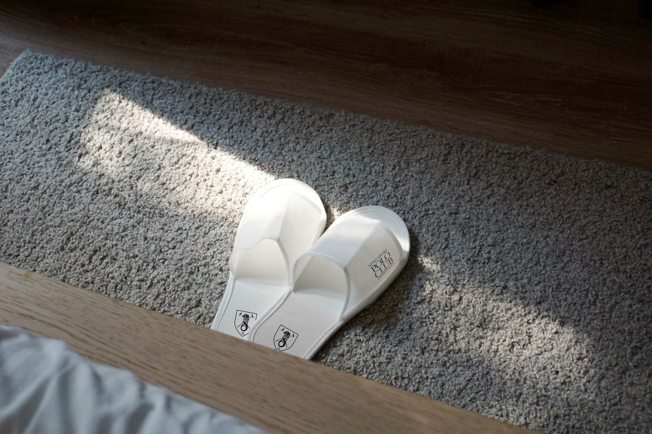
Singapore Polo Club — Heritage Modernisation
The Singapore Polo Club, established in 1886 by the United Kingdom’s King’s Regiment, carries deep institutional heritage.
Its identity was not simply a logo.
It was a historical emblem.
However, modern brand demands required:
Digital adaptability
Social media compatibility
Print flexibility
Merchandise scalability
Clear visual hierarchy across applications
The challenge was to:
Modernise without diluting legacy
Preserve symbolic integrity
Improve usability across contemporary platforms
Create a system — not a one-off redesign
This required disciplined refinement.
-
We approached the project as a Heritage Identity System — not a logo refresh.
1. Preservation of Core Symbols
Key heritage elements were carefully retained and refined.
We focused on:
Maintaining symbolic hierarchy
Enhancing clarity of core emblems
Cleaning structural inconsistencies
Improving proportional balance
The integrity of the original crest was preserved.
2. Primary & Secondary Logo Architecture
To enable modern execution, we developed:
A refined primary crest
A secondary logo system for flexible applications
This allowed the brand to function across:
Social media
Digital platforms
Print materials
Premium merchandise
Event applications
The system ensured consistency without visual compromise.
3. Cross-Platform Expression
The refreshed identity was structured to operate within:
Contemporary brand environments
Digital ecosystems
Modern production requirements
The result was a brand that honours its 19th-century roots while operating seamlessly in the 21st century.
-
The updated identity achieved:
Preserved heritage credibility
Improved visual clarity
Stronger recognisability across platforms
Structured logo system for future scalability
The Singapore Polo Club retained its legacy — while gaining modern expression discipline.


Retail & Spatial Experience
One monogram.
Three storeys of brilliance.
To translate brand radiance into architectural presence, the identity needed to scale beyond print — into space.
-
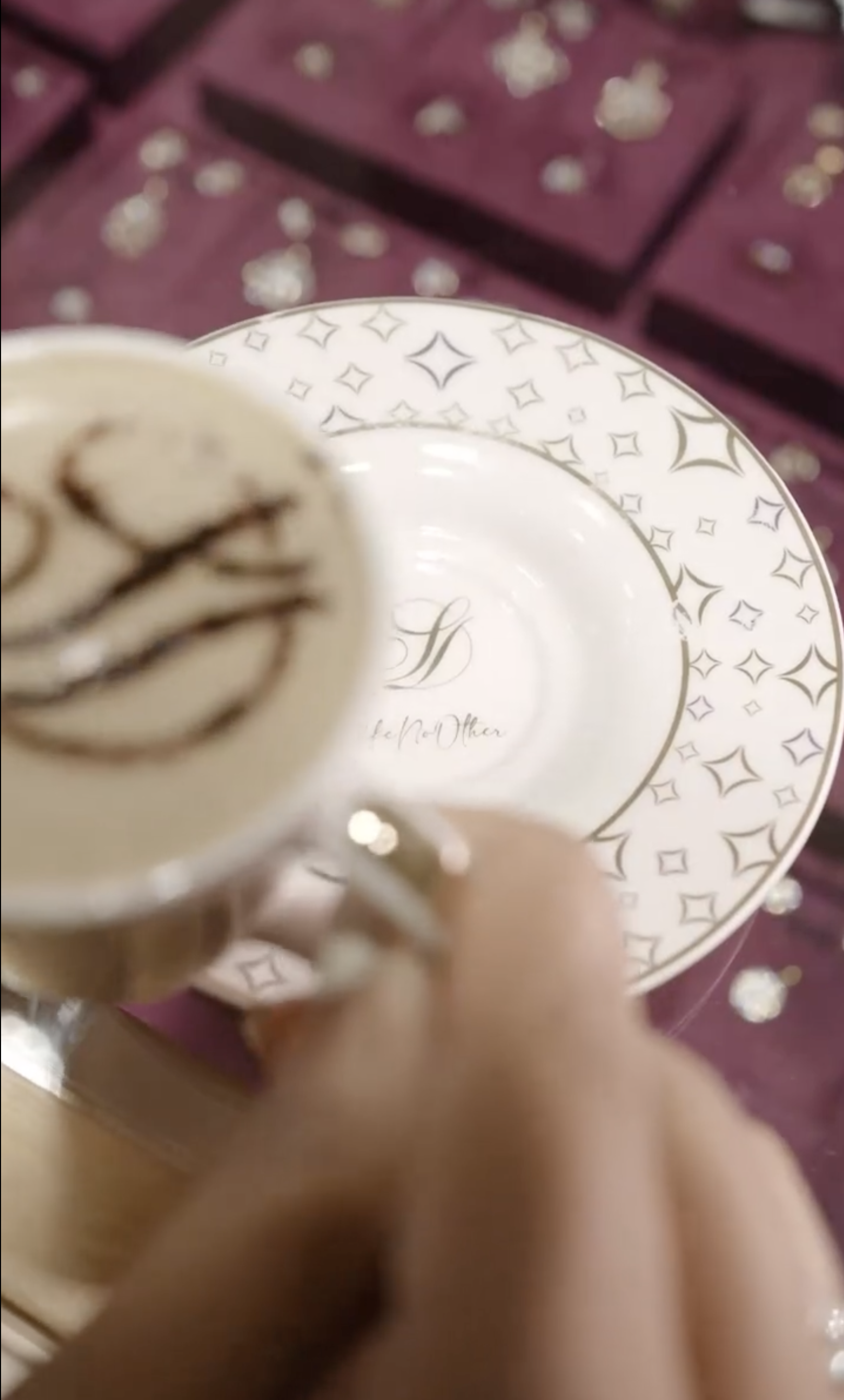
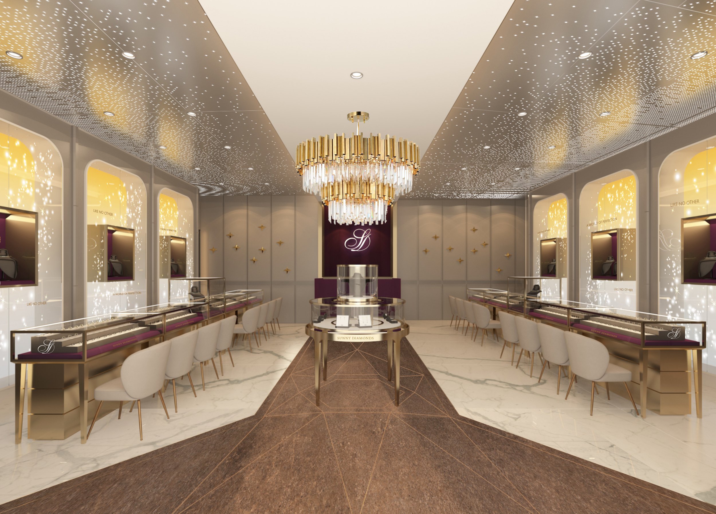
Sunny Diamonds — Flagship Identity & Facade System
Sunny Diamonds, a renowned jewellery brand in India, sought to elevate its flagship presence in Thrissur.
The objective was not simply to design a store.
It was to:
Create a recognisable flagship identity
Translate brand brilliance into architecture
Build a spatial narrative rooted in luxury
Ensure functionality without compromising elegance
Establish a visual beacon within the retail landscape
The challenge was to craft a spatial brand system — not just a facade.
-
We approached this as a Retail & Spatial Brand System.
1. Monogram as Core Brand Device
We designed a bespoke monogram inspired by the geometric brilliance of a diamond.
The form symbolised:
Radiance
Precision
Enduring value
Craftsmanship
The monogram became more than a logo.
It became a recurring architectural language.
2. Facade as Architectural Jewel
The monogram was scaled into a three-storey facade system.
The structure:
Functions as a jewel-like beacon
Anchors the building within the cityscape
Creates immediate brand recognition
Extends the identity into physical architecture
The facade was engineered with practicality in mind:
Washable and maintainable surfaces
Strategic lighting integration
Flexible illumination adjustments for occasions
Aesthetic elegance met operational longevity.
3. Interior Brand Integration
To ensure coherence, the monogram language was embedded throughout the interior.
It appeared in:
Display architecture
Focal installations
Material detailing
Spatial framing elements
The signature plum palette and plush materials established a regal tone — reinforcing exclusivity and warmth.
4. Customer-Centric Spatial Planning
We structured the layout based on behavioural flow:
Clear navigation pathways
Intimate consultation areas
Strategic product zoning
Controlled lighting to enhance diamond brilliance
Every design decision reinforced:
Trust
Luxury
Comfort
Memorability
-
The flagship achieved:
Iconic architectural presence
Strong brand recall through monogram repetition
Cohesive identity from facade to interior
Elevated customer journey experience
A retail destination — not just a store
Sunny Diamonds’ Thrissur flagship now stands as a luminous expression of brand prestige.


Packaging & Product Communication Systems
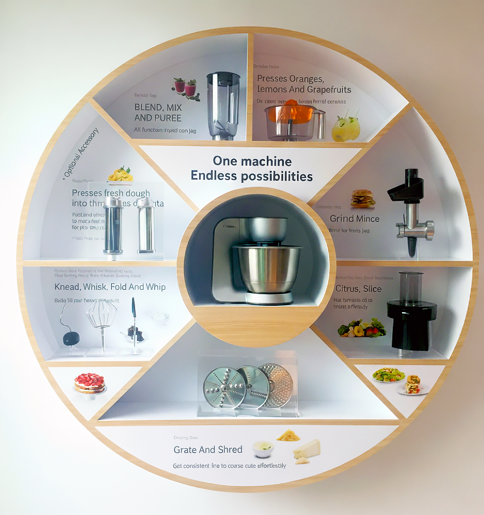
One machine.
Endless applications.
The challenge was not visibility.
It was comprehension.
-
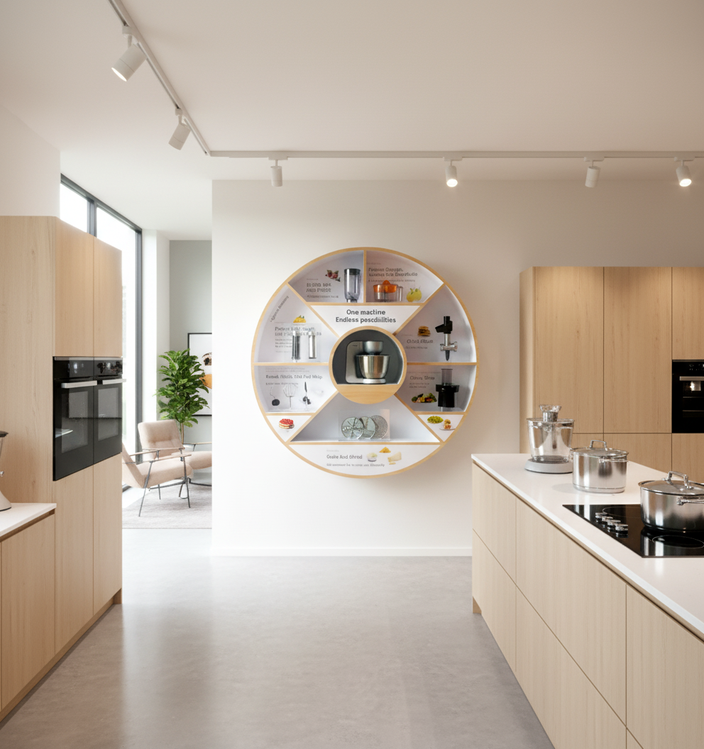
Bosch — Retail Product Display & POS System
As Bosch’s appointed creative agency, we were tasked to elevate how their home appliances were presented in-store.
The key issue:
Customers saw the machine — but did not fully understand its versatility.
The objectives were to:
Demonstrate multiple use cases clearly
Simplify technical information
Increase retail engagement
Support seasonal promotional campaigns
Enhance in-store conversion
Retail displays needed to function as education tools — not decoration.
-
We developed a Product Communication System structured around clarity and engagement.
1. Functional Demonstration Display
We designed a retail display system that visually communicates:
One machine
Multiple applications
Clear benefit hierarchy
Through structured copy and physical demonstration cues, customers could instantly grasp:
How it works
What it replaces
Why it adds value
The display shifted perception from “appliance” to “versatile solution.”
2. Structured Messaging Architecture
We refined technical details into:
Succinct copy
Clear benefit statements
Easy-to-scan information blocks
Logical reading flow
The communication system prioritised:
Clarity over complexity
Benefit over specification
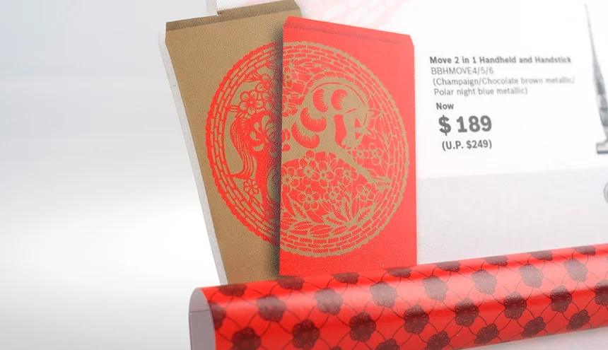
3. 3D POS Campaign Extensions
For festive promotions, we created 3D pop-up POS collaterals that:
Commanded attention within retail environments
Reinforced Bosch’s premium positioning
Announced promotions without clutter
Maintained brand discipline
The dimensional elements introduced depth and visual distinction while keeping messaging concise.
-
The system achieved:
Improved customer understanding of product versatility
Stronger in-store engagement
Clearer promotional communication
Elevated retail display standards
Consistent brand presence across campaigns
Bosch’s showroom environment shifted from product display — to guided product experience.


Experiential & Service Touchpoint System
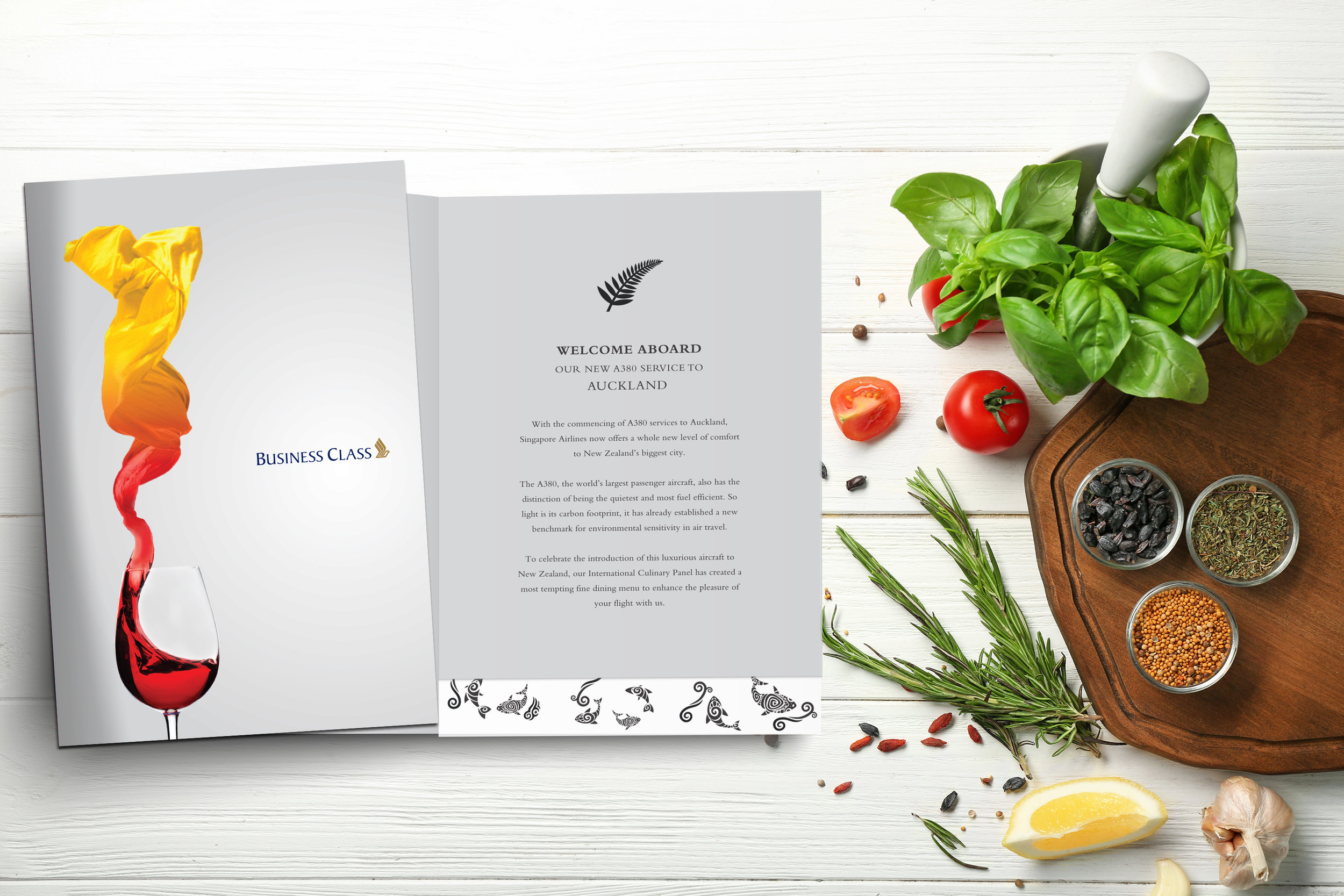
At 30,000 feet,
every detail is amplified.
In premium aviation, even a menu becomes part of the journey.
-
Singapore Airlines — Refining the Inflight Dining Experience
Singapore Airlines places strong emphasis on inflight dining across all cabin classes.
The menu is not merely informational — it is part of the hospitality ritual.
The project required:
Designing menu covers for all cabin classes
Creating seasonal and holiday variations
Developing introduction pages for multiple destinations
Ensuring usability within the physical constraints of an aircraft cabin
Reflecting Singapore Airlines’ premium brand standards
The challenge was to elevate a functional object into a refined service touchpoint.
-
We approached the assignment as a Service Touchpoint System — designing menus that enhance the inflight experience rather than interrupt it.
1. Cabin-Specific Refinement
Each class of travel carries different expectations.
The design language was carefully calibrated to:
Reflect subtle hierarchy between cabin classes
Maintain brand consistency across formats
Ensure elegance without excess
Differentiation was achieved through restraint — not decoration.
2. Minimalist Graphic Discipline
Given the unique environment of an aircraft cabin — compact space, variable lighting and movement — clarity was essential.
We implemented:
A minimalist graphic approach
Controlled use of pleasant, calming colours
Balanced layout hierarchy
Clean typography for legibility
Every element was placed with intent — ensuring visual harmony and ease of use.
3. Destination Narrative Integration
Introduction pages were designed to introduce destinations served by Singapore Airlines.
This transformed the menu from a food list into a narrative extension of the journey — reinforcing the airline’s global presence and service excellence.
4. Seasonal & Occasion Adaptability
The system was engineered to support:
Holiday editions
Special occasions
Thematic variations
While maintaining brand coherence across all iterations.
Consistency sustains premium perception.
-
The menu system achieved:
Elevated perception of inflight dining
Improved usability within cabin constraints
Consistent brand expression across classes
Flexible system for seasonal adaptation
In premium aviation, hospitality lives in the details.
A menu is not paper.
It is part of the brand experience.


BRANDS WE WORK WITH


THINKING AHEAD
-
LIFESTYLE & RETAIL
-
THINKING AHEAD - LIFESTYLE & RETAIL -