Branding Agency for Business & Professional Services Companies in Singapore and Asia
Business and professional service firms compete in markets where trust, expertise and credibility are essential. From consulting firms and corporate service providers to legal, accounting and advisory companies, strong branding helps organisations communicate professionalism, authority and differentiation.
DWHQ is a Singapore-based branding consultancy that helps business and professional service companies across Singapore and Asia build clear, trusted brands. Through brand strategy, positioning and AI-ready digital presence, we help service organisations strengthen credibility, communicate expertise and stand out in competitive professional markets.
In professional services, trust precedes engagement.
We help business service firms strengthen positioning, authority and communication systems as competition intensifies and differentiation becomes harder to sustain.
Where Business Service Firms Lose Clarity
Where Professional Firms Struggle to Differentiate
As markets mature and service offerings overlap, clarity becomes fragile.
Common challenges include:
Service-led messaging instead of purpose-led narratives
Difficulty articulating unique methodologies or intellectual property
Websites that list capabilities but fail to signal authority
Thought leadership that exists but lacks structural visibility
Misalignment between partner messaging and firm-level positioning
Loss of strategic direction as firms grow beyond founder-led identity
Expansion into new services without reinforcing core purpose
These are not marketing issues.
They are authority gaps.
As firms expand services and compete for higher-value clients, clarity becomes harder to sustain.
Without deliberate positioning architecture, firms appear interchangeable.
In professional services, similarity erodes trust.
How We Help Business Services Clients
Strengthening Authority as Markets Mature
Campaign Identity & Brand Extension Systems
Designing adaptable brand assets and visual frameworks that allow corporate brands to evolve across seasons, campaigns and cultural moments without diluting core identity.
Corporate & Sustainability Reporting Systems
Structuring annual and sustainability reports to align corporate direction with stakeholder expectations and long-term credibility.
Product & Technical Communication Systems
Translating complex services and product offerings into structured brochures, catalogues and sales materials that articulate clarity and value.
Retail & Spatial Experience
Designing physical environments that translate brand narrative into immersive, coherent experiences.
BRANDS WE WORK WITH
Campaign Identity & Brand Extension Systems
One global icon.
Multiple cultural moments.
To increase brand awareness without diluting identity, the campaign required structured brand extension — not festive decoration.
-
DHL — Seasonal Brand Adaptation Framework
DHL sought to strengthen brand recall using its iconic yellow-and-red deliveryman as the central campaign asset.
The objective was to adapt the character across multiple occasions:
Christmas
Formula 1 season
Great Singapore Sale
Track Rewards Anniversary
The challenge was not illustration.
It was system control.
We needed to:
Capture the spirit of each occasion
Maintain strict global brand guidelines
Preserve recognisability of the deliveryman silhouette
Avoid visual dilution across campaign variations
Ensure all adaptations reinforced DHL’s core brand values
The brand asset had to evolve — without losing structural integrity.
-
We developed a structured Campaign Identity Extension System.
1. Iconic Character Framework
The DHL deliveryman was treated as a core brand asset — not a seasonal mascot.
We standardised:
Posture
Walking motion
Silhouette recognisability
Uniform integrity
Colour hierarchy
Each adaptation preserved the deliveryman’s confident and cheerful forward movement — symbolising reliability and positive service delivery.
2. Occasion-Specific Adaptation
Each campaign variation integrated contextual elements:
Festive accessories
Cultural motifs
Promotional elements
Anniversary symbolism
These additions were controlled overlays — never replacing the core identity.
The yellow and red brand structure remained dominant.
3. Emotional Positioning
Rather than focusing on product messaging, the design emphasised:
Joy
Celebration
Positivity
Trustworthiness
The deliveryman was positioned as a symbol of happiness delivered — reinforcing DHL’s service commitment beyond logistics.
-
The campaign achieved:
Strong brand consistency across multiple occasions
Memorable visual recall
Increased engagement during festive periods
Reinforced emotional association with reliability and joy
Despite seasonal variation, the core brand identity remained intact and recognisable.
The deliveryman evolved — without compromising global brand discipline.


Product & Technical Communication Systems
Complex chemistry.
Commercial market reality.
To expand market share in Asia, technical leadership had to be translated into customer-relevant clarity.
-
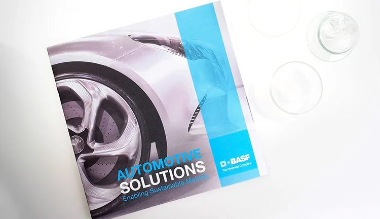
BASF — Automotive Chemical Solutions (Asia)
As a global leader in chemical solutions for the automotive industry, BASF required a communication tool that would:
Strengthen brand authority in Asia
Differentiate from competing chemical suppliers
Increase product awareness
Support commercial growth
However, the existing communication approach leaned heavily on:
Technical specifications
Chemical formulations
Industry jargon
While accurate, it did not fully connect with:
Procurement decision-makers
Regional partners
Commercial stakeholders
The challenge was not to simplify science — but to structure it into relatable value.
-
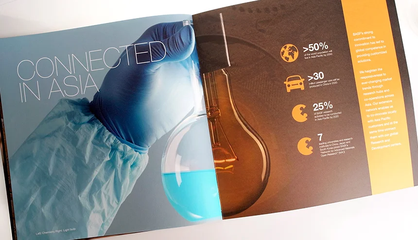
We developed a Product & Technical Communication System that repositioned complexity into clarity.
1. Customer-Oriented Translation
Rather than focusing on chemical detail, we reframed content around:
Application relevance
Partnership value
Sustainability impact
End-product outcomes
Technical depth remained intact — but presented through a customer-first narrative lens.
2. Material & Sensory Reinforcement
The brochure was printed on an avant-garde tactile paper made from potato starch.
This was not aesthetic experimentation.
It reinforced:
Sustainability commitment
Material innovation
Tangible differentiation
Partnership philosophy in Asia
The medium supported the message.
3. Visual System Integration
Real-life imagery was structured to create a seamless journey:
Chemistry formulation → Component integration → Finished automotive application
This visual sequencing connected:
Laboratory precision
Industrial application
End-market value
Complexity became comprehensible.
-
The final communication system achieved:
Stronger differentiation within the automotive chemical sector
Improved product relevance perception
Clearer value articulation for Asian markets
Enhanced brand authority through sensory and visual alignment
Technical leadership was no longer presented as specification.
It was presented as partnership and performance.


Retail & Experiential Brand Systems
A print shop.
Inside a sports arena.
To make the space relevant, the brand experience had to reflect its environment — not just its function.
-
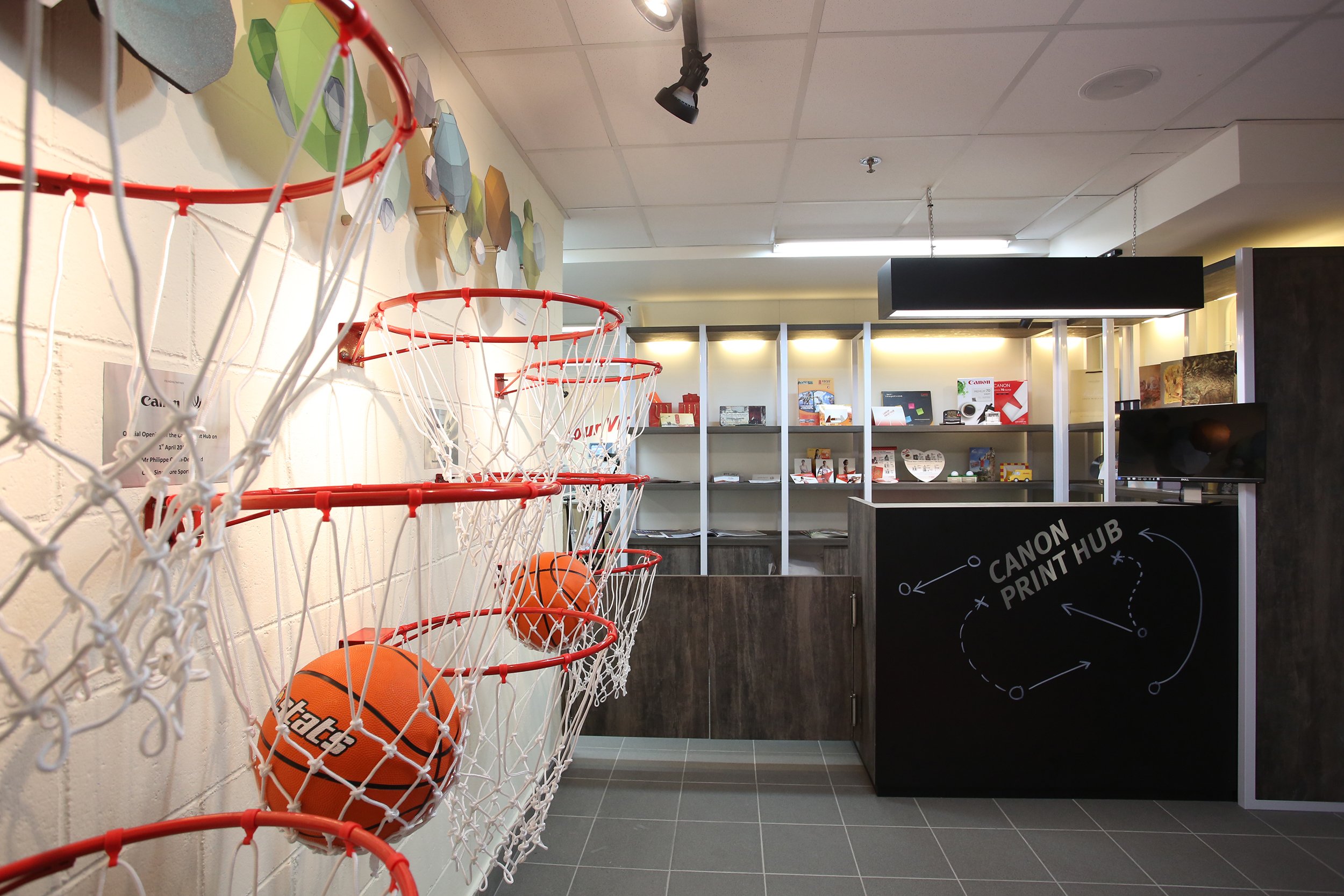
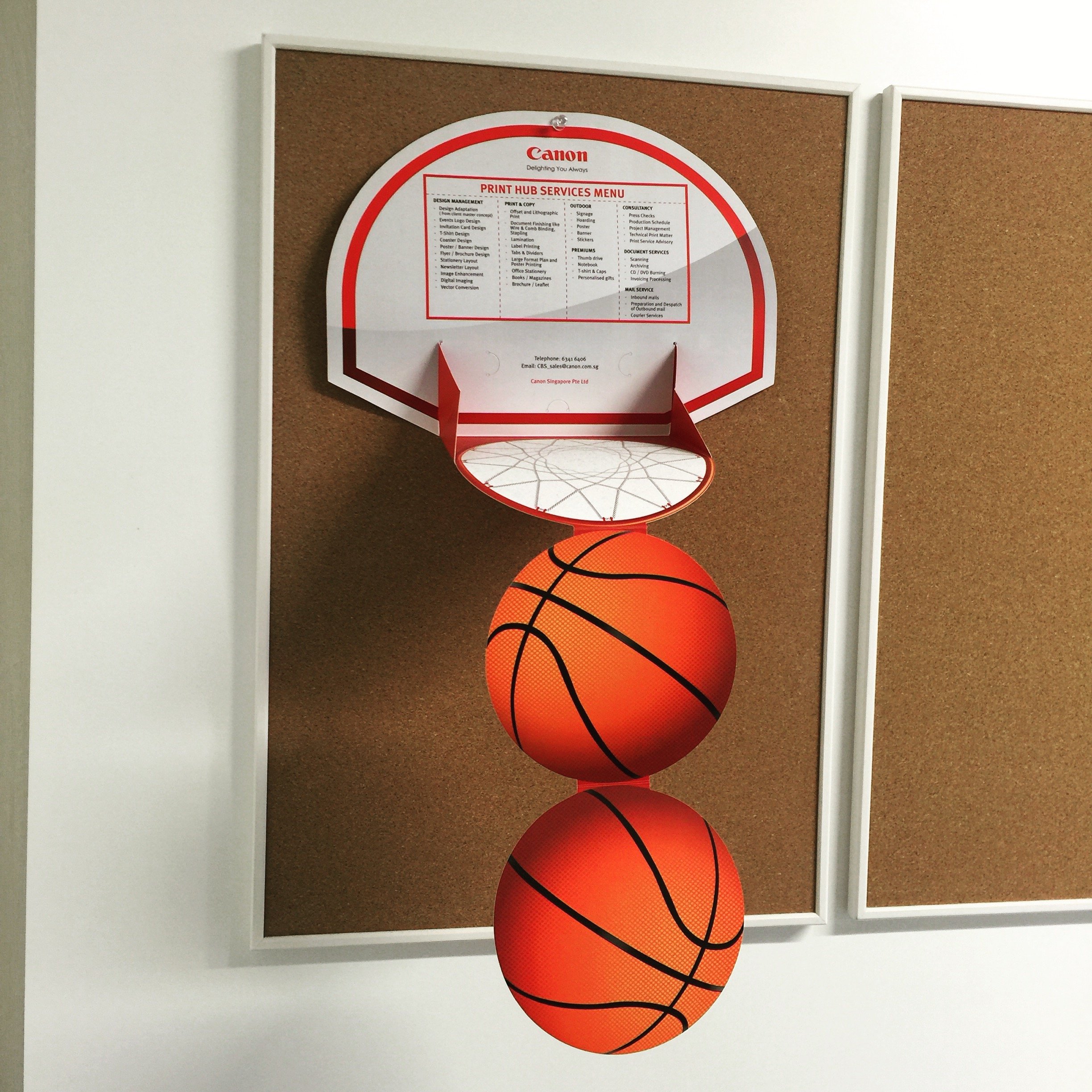
Canon Print Hub — Singapore Sports Hub
Canon envisioned a Print Hub within the Singapore Sports Hub to service retailers operating in the complex.
The opportunity was strategic:
High foot traffic environment
Sporting atmosphere
Performance-driven audience
Retail operational demands
However, a printing shop typically signals:
Functional
Process-heavy
Operational clutter
Low emotional engagement
The challenge was to:
Merge print operations with a sporting narrative
Translate Japanese brand discipline into spatial clarity
Design for workflow efficiency
Create an experiential environment that felt energetic yet organised
Extend the theme consistently across space and communication materials
This required a structured spatial identity system — not decorative branding.
-
We developed a Retail & Experiential Brand System rooted in context and culture.
1. Sport-Led Spatial Narrative
The Sports Hub location became the conceptual anchor.
We integrated sporting elements throughout the space:
Cutting table designed to double as a table tennis competition surface
Badminton net used as a dynamic proofing display board
Basketball hoop installation at the flagship entrance
Direct mailer concept inspired by scoring through a hoop
The space became a metaphor for performance and goal achievement.
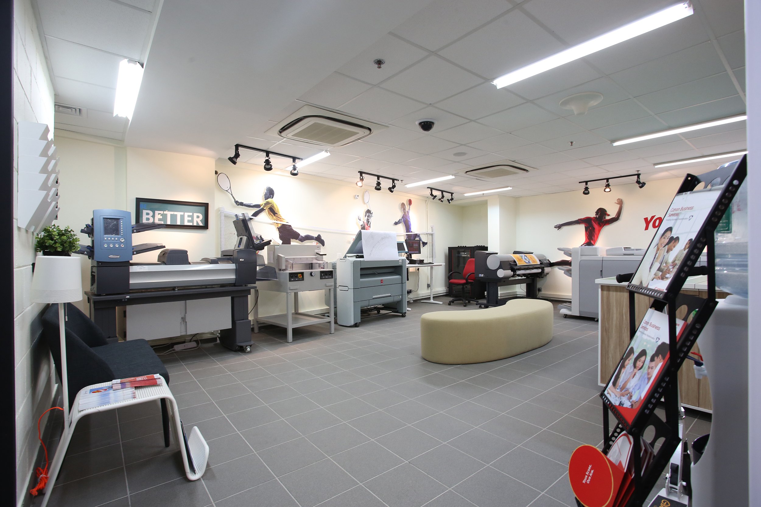
2. Workflow & Operational Clarity
As a printing facility, operational order was critical.
We translated Japanese culture of precision and organisation into spatial design:
Clean zoning of workflow
Clear visual guidance
Envelope sizes illustrated in chalk-style graphics on black doors
Organised portfolio shelving at the counter
The environment supported productivity — without sacrificing identity.
3. Motivational Brand Environment
We infused performance mindset messaging throughout the hub:
Sports-inspired motivational messages
Achievement-focused visual cues
Energy-driven spatial flow
Even customer waiting areas were designed as a “chill corner” — balancing efficiency with comfort.
4. Integrated Communication System
The sporting theme extended beyond space into:
Direct mailers
Visual signage
Display materials
Every touchpoint reinforced the same narrative of performance, discipline and achievement.
-
The Canon Print Hub became:
A contextually relevant retail environment
An operationally efficient workspace
A spatial expression of brand discipline
A differentiated experience within the Sports Hub
The space did not merely function as a print service.
It embodied performance, organisation and goal-driven identity.


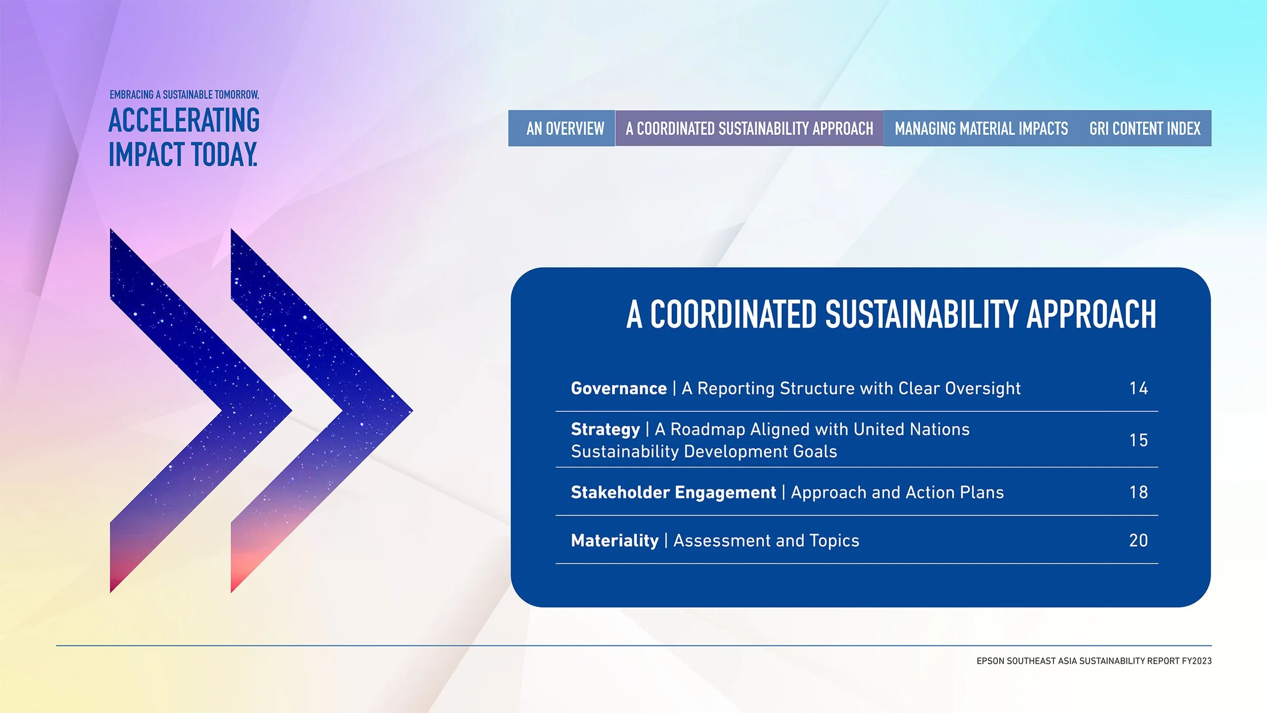
Corporate & Sustainability Reporting Systems
Technical sustainability data.
Broad stakeholder expectations.
To strengthen corporate credibility, the report had to move beyond compliance — into clarity.
-
Epson Southeast Asia — Digital Sustainability Report
Epson Southeast Asia sought to elevate its annual sustainability report.
The objective was not only regulatory fulfilment —
but effective communication of environmental commitments to:
Investors
Industry partners
Corporate stakeholders
The broader public
The foundation was a specialised white paper developed by GGC, a sustainability consulting firm.
While comprehensive, the document contained:
Technical terminology
Industry-specific sustainability frameworks
Dense environmental reporting structures
The challenge was to preserve depth — while expanding accessibility.
This required translation, not simplification.
-
We developed a Corporate & Sustainability Reporting System built on clarity and engagement.
1. Expert Collaboration & Content Integrity
We worked closely with:
GGC sustainability consultants
Epson’s Sustainability Key Leaders
This ensured:
Accuracy of reporting
Alignment with corporate sustainability objectives
Preservation of technical credibility
Design decisions were grounded in strategic intent — not aesthetics alone.
2. Structured Information Translation
The white paper content was reframed into:
Layman-accessible narratives
Structured thematic sections
Clear environmental commitment pillars
Digestible data explanations
Technical rigour remained intact —but communication became inclusive.
3. Visual Authority & Infographic System
We transformed the report into a visually structured digital document featuring:
Strong editorial hierarchy
Impactful infographics
Data visualisation systems
High-quality corporate imagery
The design highlighted:
Environmental commitments
Product innovation
Long-term sustainability direction
The report became a strategic communication tool — not just an archive.
4. Interactive Digital Experience
To further increase engagement, we developed an interactive PDF system incorporating:
Rollover buttons
Clickable navigation
Dynamic content exploration
This elevated the reading experience and encouraged deeper stakeholder engagement.
-
The final sustainability report achieved:
Broader stakeholder accessibility
Strengthened corporate sustainability positioning
Enhanced digital engagement
Elevated perception of transparency and leadership
Epson’s sustainability commitment was no longer buried in compliance documentation.
It was communicated with clarity, structure and authority.


THINKING AHEAD
-
BUSINESS SERVICES
-
THINKING AHEAD - BUSINESS SERVICES -