
Branding Agency for Construction & Property Companies in Singapore and Asia
Construction and property companies operate in industries where credibility, reputation and long-term trust are essential. From real estate developers and property firms to construction and infrastructure companies, strong branding helps communicate expertise, reliability and project capability.
DWHQ is a Singapore-based branding consultancy that helps construction and property companies across Singapore and Asia build clear, trusted brands. Through brand strategy, positioning and AI-ready digital presence, we help organisations strengthen credibility, communicate capability and stand out in competitive property and infrastructure markets.
In construction and property, reputation precedes project award.
We help developers and engineering-led organisations stabilise positioning, project communication and brand architecture as portfolios expand and stakeholder scrutiny increases.
Where Construction Firms Lose Perception Alignment
Common challenges include:
Corporate websites that do not reflect project scale or technical depth
Annual reports positioned as compliance documents rather than credibility assets
Fragmented communication between corporate and project narratives
Sustainability positioning not structurally integrated
Growth-stage firms operationally mature but visually outdated
As portfolios expand and projects increase in scale, perception must evolve alongside capability.
These are not marketing issues.
They are institutional credibility gaps.
In construction, perception influences tender confidence and investor trust.
Where Property Brands Lose Coherence
Common challenges include:
Individual developments lacking strong identity distinction
Mall and retail environments disconnected from master brand positioning
Experiential spaces not reinforcing brand value
Office and corporate interiors not reflecting developer positioning
Event activations that lack narrative coherence
As developments expand across locations and asset types, consistency becomes fragile.
These are not campaign gaps.
They are place identity systems gaps.
In property, perception shapes buyer confidence and tenant quality.
How We Help Construction and Property Clients
Strengthening Corporate Credibility and Development Value
Digital Credibility Systems
Restructuring websites to align perception with operational scale — strengthening investor and partner confidence.
Experiential & Mall Engagement
Designing event systems and retail activations that reinforce place narrative and community engagement.
Development Identity Systems
Creating identity systems for individual properties that align with master developer positioning.
Corporate Positioning & Identity Systems
Defining positioning systems that reflect engineering maturity and long-term stability.
Construction Branding Case
Two industries.
One legacy name.
To scale without dilution, the brand needed structural separation — while preserving 52 years of industrial credibility.
-
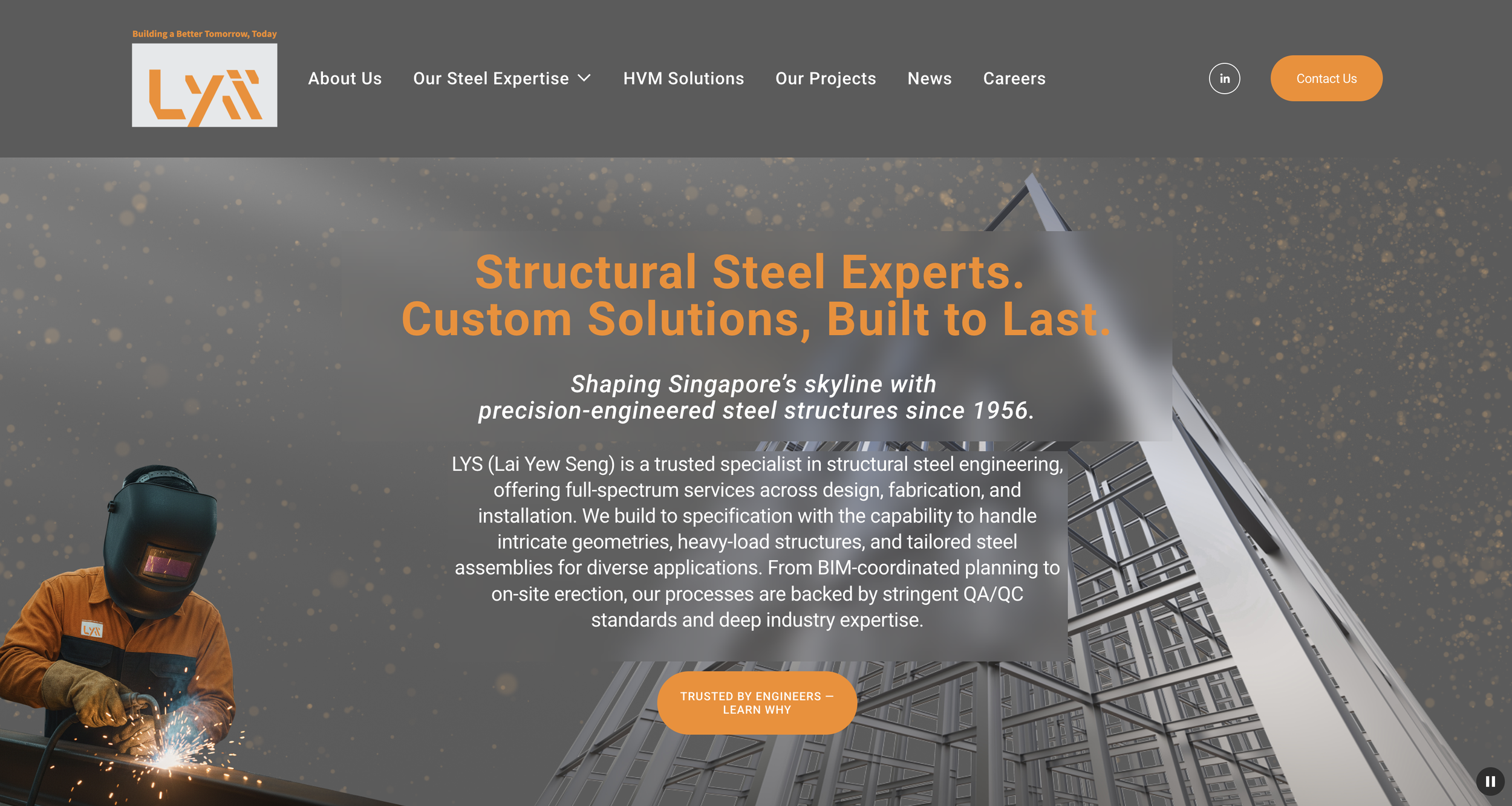
LYS
After 52 years as a pioneer in steel structures, Lai Yew Seng had grown beyond its original positioning.
The company was serving two distinct customer segments:
Large-scale steel structure engineering
Security bollards and perimeter protection systems
However, both were operating under a single brand identity.
As the business expanded, the overlap created positioning ambiguity:
Steel structure clients and security infrastructure clients had different decision-makers
The legacy name carried heritage strength, but limited scalability
The bollard segment required expansion beyond a single product category
Digital presence did not reflect sector differentiation
Operational growth had outpaced brand clarity.
-
We advised a structural brand separation while preserving institutional heritage.
The transformation included:
1. Strategic Brand Split
Retained the steel structure business under a modernised identity — LYS
Preserved “Lai Yew Seng” within corporate materials to honour 52 years of heritage
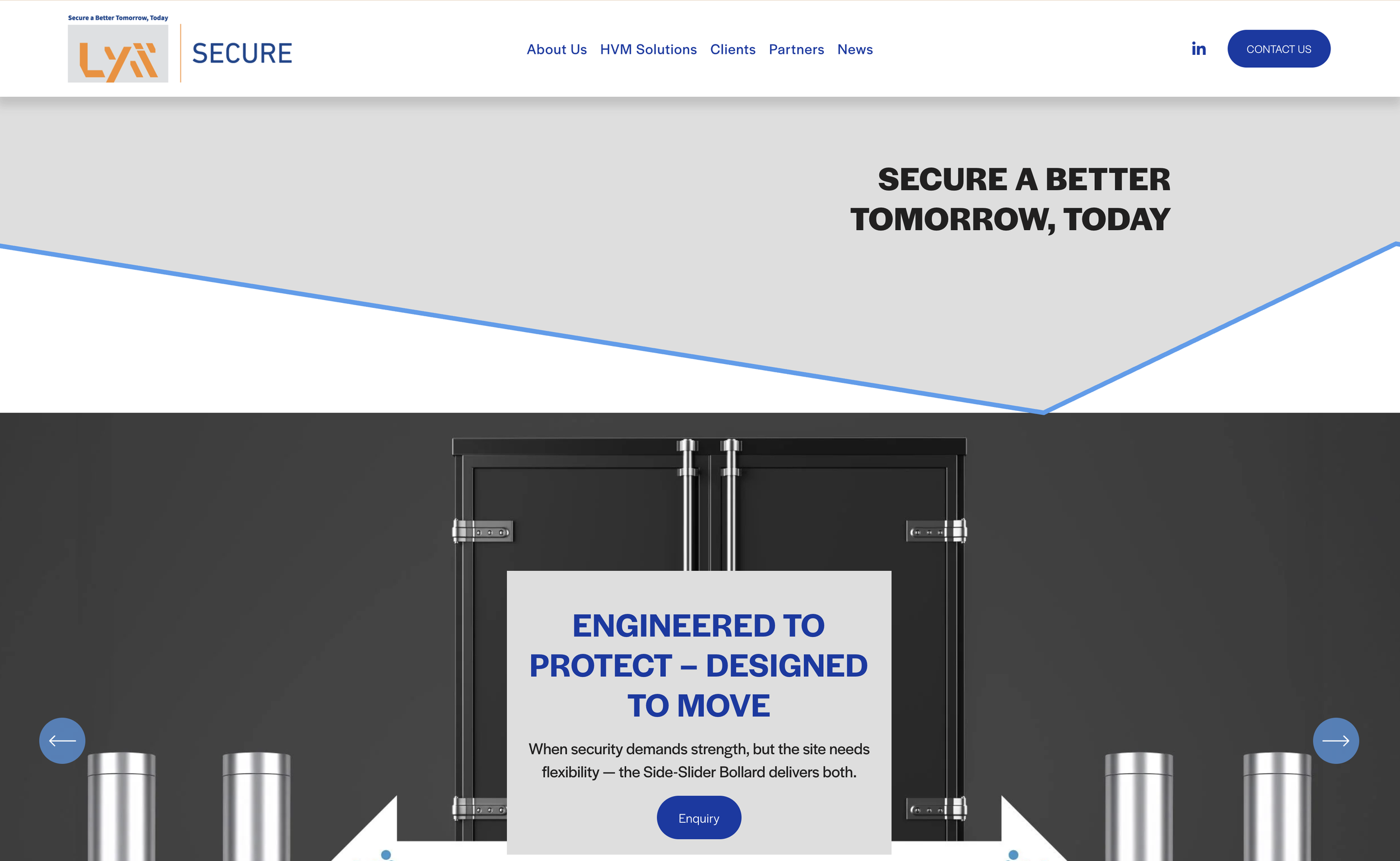
Created a new brand — LYS Secure — to position the bollard division for broader security infrastructure expansion
This enabled:
Clearer sector positioning
Distinct customer targeting
Future product line expansion
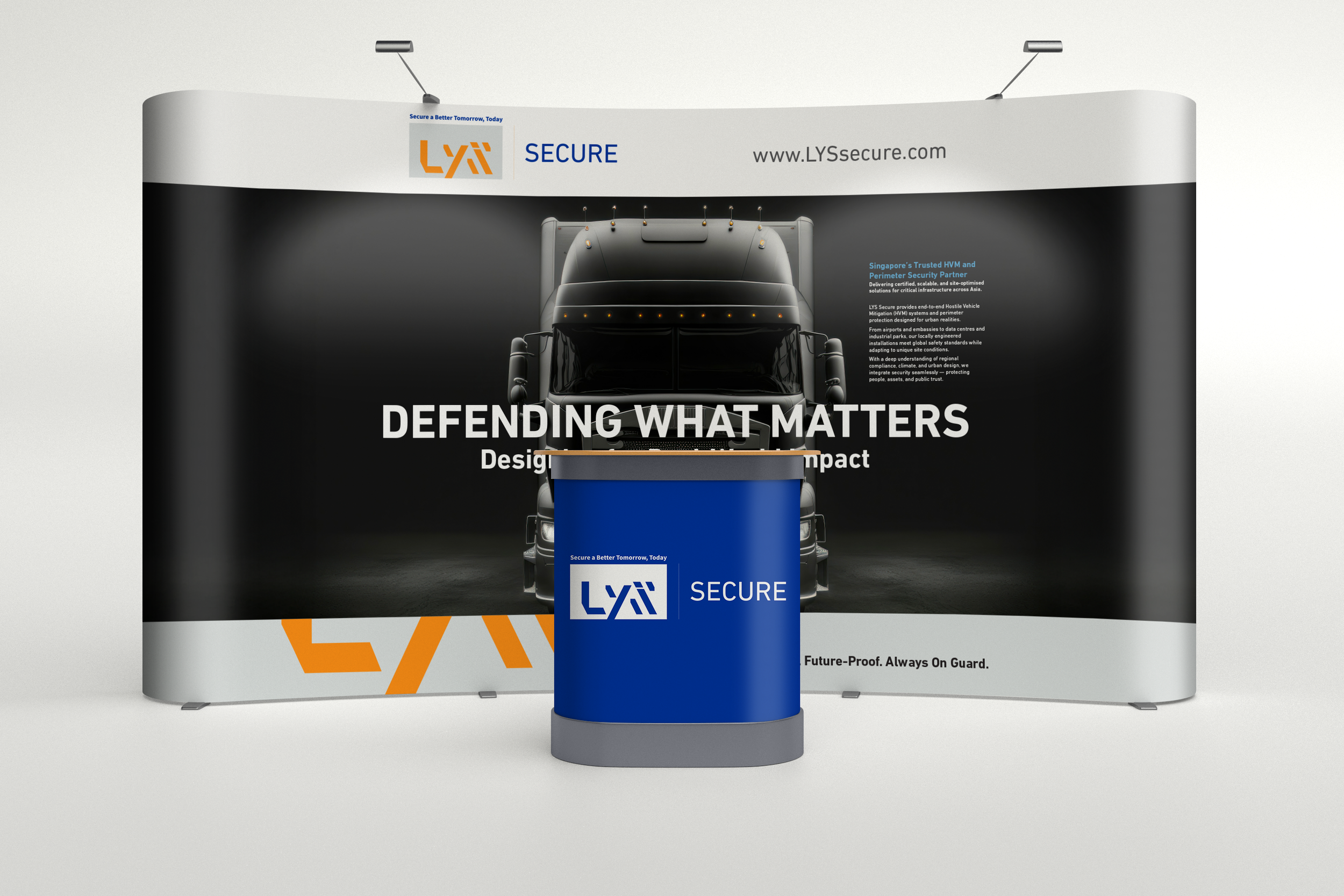
2. Unified Brand System Through “Foundation”
To maintain cohesion across both brands, we introduced a shared secondary visual element:
“Foundation”
A cropped LYS typographic footer embedded across both identities.
It symbolised:
Deep structural grounding for steel engineering
Embedded security strength for bollard systems
One concept.
Two industries.
Shared structural philosophy.
3. Digital & AI Visibility Strategy
We developed two differentiated websites reflecting:
Engineering scale and industrial credibility (LYS)
Security, perimeter protection and infrastructure authority (LYS Secure)
Both platforms were structured with AI discoverability in mind.
We continue supporting content visibility through:
Specialised industry articles
AI-aligned blog development
Structured keyword architecture
Sector-specific authority positioning
This ensured digital clarity matched brand separation.
-
The organisation now operates with two distinct yet strategically aligned brands.
Clear visual identity separation through colour and naming
Sector-specific messaging and customer targeting
Ability to cross-sell between structural engineering and security solutions
Preserved heritage credibility while enabling modern expansion
Strengthened AI search visibility through structured digital positioning
The transformation moved the company from a legacy steel firm to a structured multi-sector industrial brand system.
Clarity enabled expansion without dilution.


Digital Credibility Systems
Thirty years of operational growth.
One outdated digital perception.
To scale credibility in the AI era, the website needed restructuring — aligning market authority with real operational scale.
-
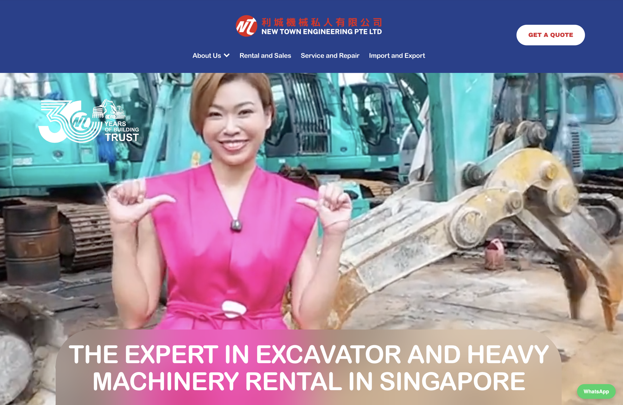
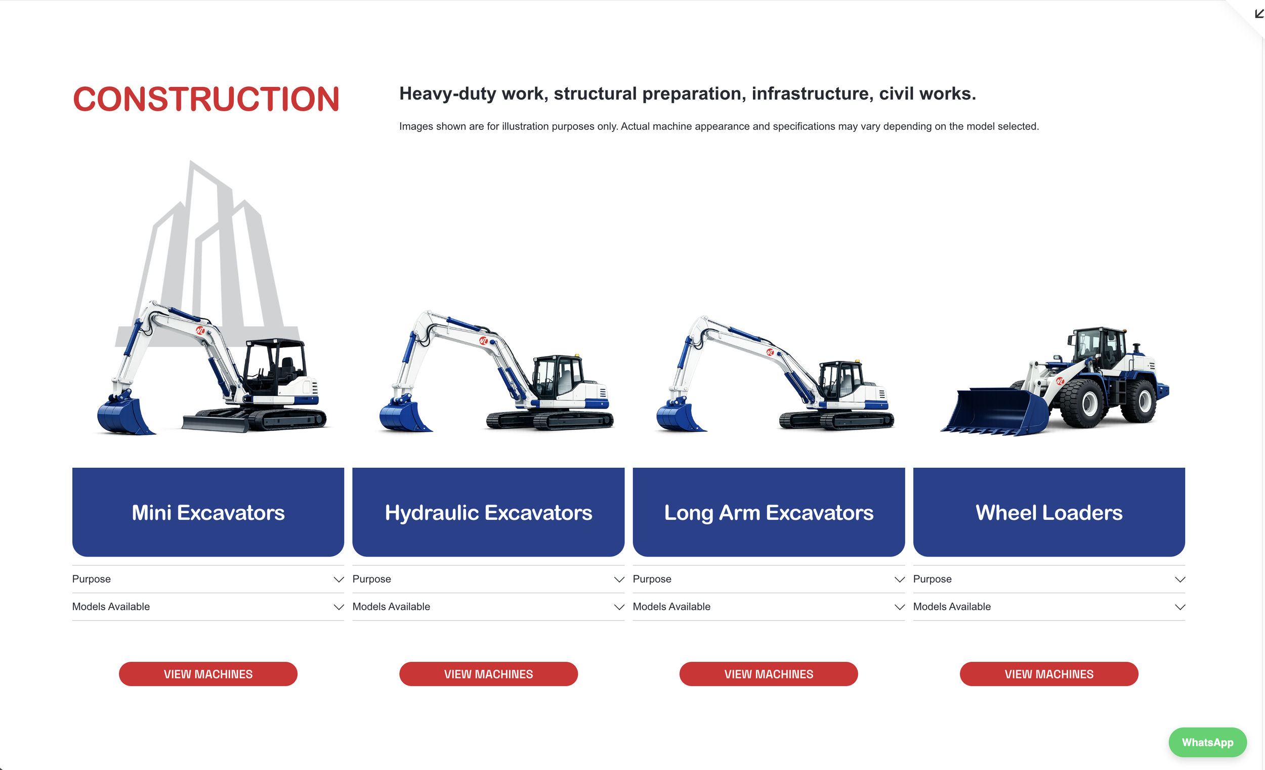
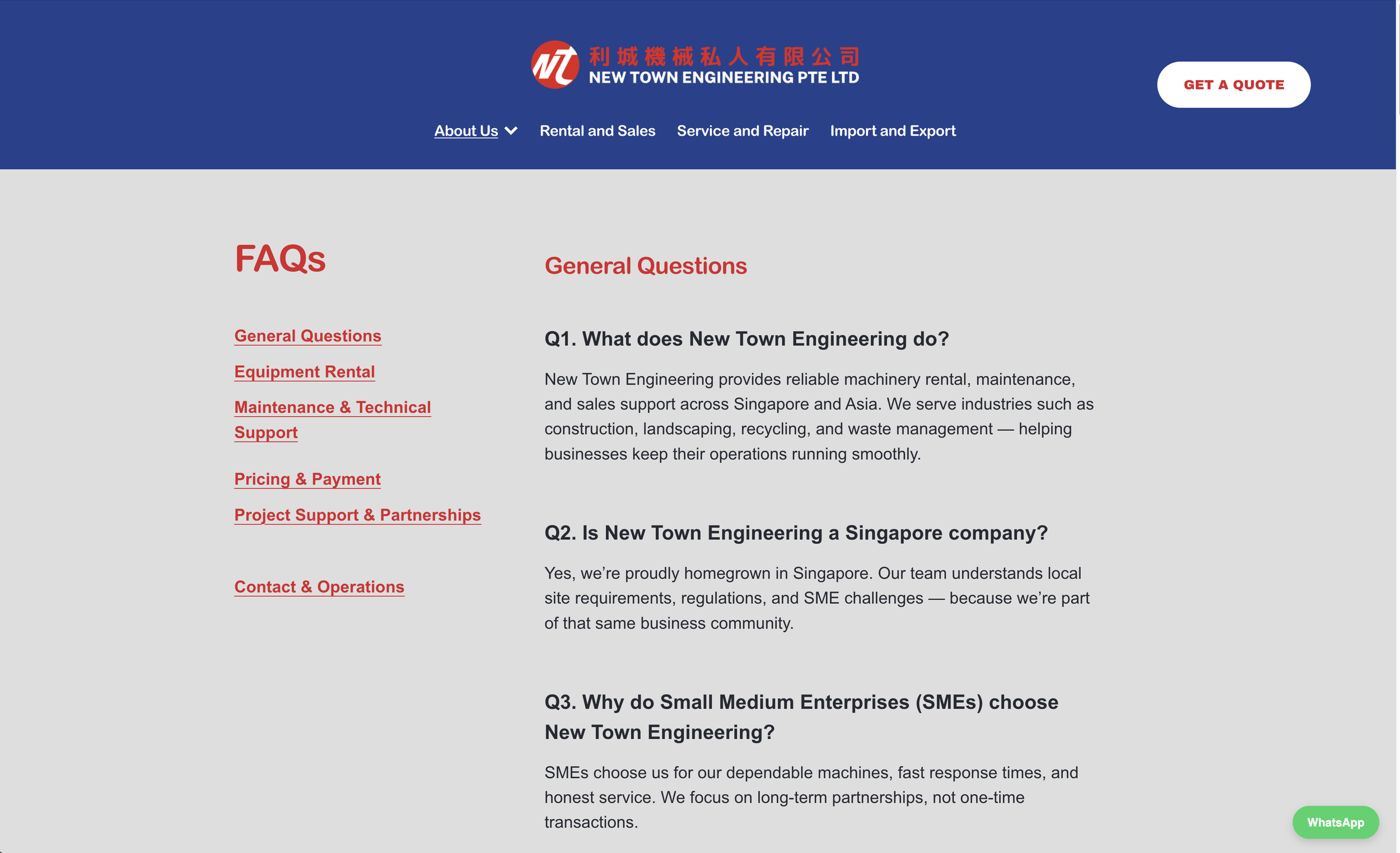
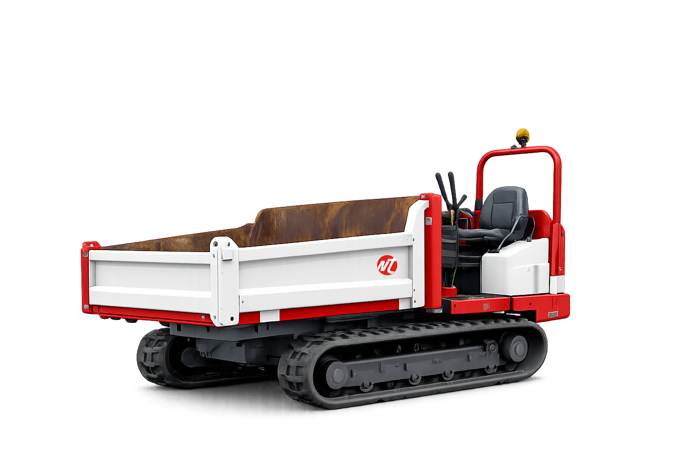
New Town Engineering
New Town Engineering had built three decades of presence in heavy machinery sales and rental.
Their SEO performance was strong.
Their reputation in the industry was established.
But:
The website had not evolved with their operational growth
Machine listings were not systematically updated
Content structure did not reflect rental demand dominance
Limited AI-search visibility despite strong domain history
Digital perception lagged behind actual scale
In the AI era, visibility is no longer just ranking — it is structured authority.
The platform needed to signal:
Scale
Relevance
Currency
Industry leadership
-
We restructured their digital presence into a credibility system.
1. Platform Modernisation
Migrated to Squarespace to enable:
Faster internal updates
Cleaner machine cataloguing
Structured content architecture
Visual consistency
We identified and trained internal team members to continuously update:
New machinery models
Rental availability
Equipment imagery
This shifted the website from static brochure to living authority platform.
2. Market Repositioning Toward Rental Leadership
After analysing 30 years of growth data, we identified rental as the dominant expansion engine.
We:
Reorganised site hierarchy around Rental priority
Clarified messaging around support and after-sales reliability
Simplified navigation for contractors and procurement teams
The website now reflects demand reality — not historical positioning.
3. AI-Visibility & Industry Authority
We developed:
Industry-specific articles
Comprehensive FAQ sections
Structured answers aligned to search intent
Clear service categorisation
This strengthens:
AI discoverability
Industry question visibility
Investor and partner confidence
-
The website now reflects operational scale.
Up-to-date machinery catalogues
Clean, structured industrial presentation
Clear rental leadership positioning
Improved AI visibility through structured content
Stronger perception alignment with 30-year authority
Clients can now:
Find information easily
Trust availability
See current capabilities
Recognise long-term reliability
Digital presence now matches industrial credibility.


Development Identity Systems
Multiple properties.
One master developer vision.
To strengthen portfolio coherence while preserving architectural individuality, each building required a distinct yet system-aligned identity.
-
CapitaLand Office Portfolio
CapitaLand’s office developments — including:
CapitaGreen
Twenty Anson
One George Street
Each building had its own architectural language and structural personality.
The challenge was not simply logo creation.
It was to:
Translate architectural intent into identity
Ensure visual distinction between properties
Maintain alignment with master developer positioning
Design marks that function at architectural scale
Create systems usable by architects, contractors and fabricators
The identity had to work across:
Signage
Facade applications
Leasing materials
Environmental graphics
Portfolio communications
These were not branding exercises.
They were built-environment systems.
-
We approached each property as a structured identity system.
1. Architecture-Led Identity Design
Each logo was derived from:
Building form
Structural rhythm
Core architectural concept
Spatial language
The identity was not applied to the building.
It emerged from it.
2. Signage & Environmental Functionality
We ensured the identity system could:
Scale across facade signage
Maintain legibility at distance
Integrate into material finishes
Support wayfinding and environmental graphics
Technical considerations were embedded early to avoid future contractor compromise.
3. Portfolio Alignment
While distinct, each building identity:
Maintained tonal alignment with CapitaLand’s corporate positioning
Reinforced portfolio prestige
Strengthened recognition across office assets
This preserved developer authority while allowing property-level individuality.
-
Each property now holds:
A distinct architectural identity
A signage-ready visual system
Strong recognisability within the skyline
Cohesion within the CapitaLand office portfolio
The buildings are not only structurally iconic —
their identities are systemically aligned and operationally functional.


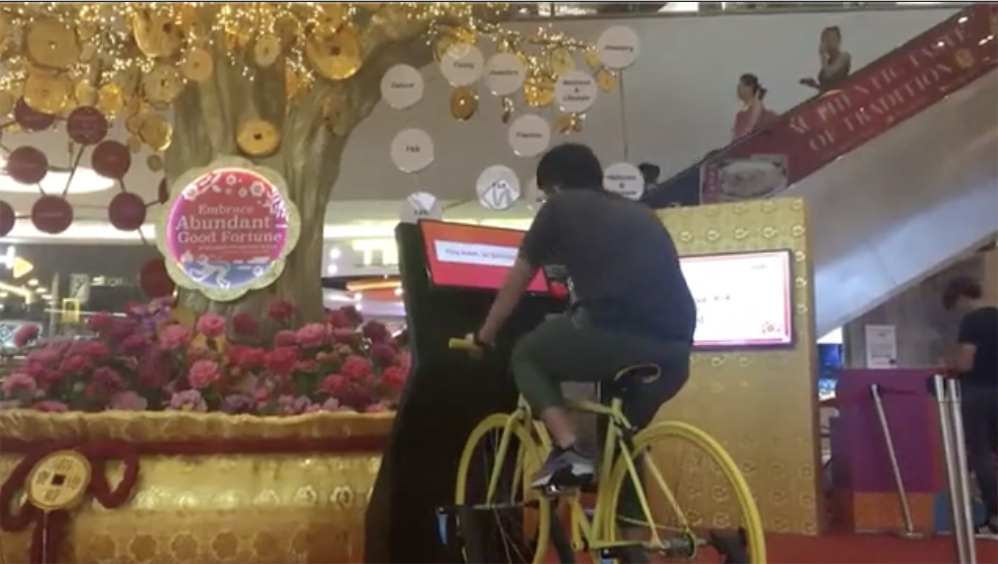
Experiential & Mall Engagement
A new mall.
A new community.
To launch with relevance, engagement had to reflect how residents actually live — not just how malls typically promote.
-
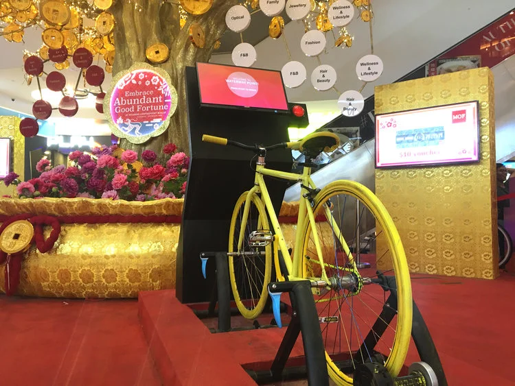
Frasers Property — Punggol Waterway Point Launch
Frasers Property was launching Punggol Waterway Point — a new shopping destination located within a park-connected cycling district.
The audience profile revealed:
High proportion of young families
Active residents
Strong cycling culture
Mall positioned beside park connectors and waterfront
The challenge was not simply festive decoration.
It was to:
Create meaningful engagement for Chinese New Year
Connect mall identity to community lifestyle
Translate a lucky draw mechanic into a physical, kinetic experience
Drive participation beyond passive viewing
The engagement needed to feel local.
Not generic festive programming.
-
We developed an experiential system rooted in place behaviour.
1. Audience-Led Concept
Cycling was not introduced as a gimmick.
It was already embedded in the community’s daily life.
We designed two interactive bicycle stations that allowed shoppers to:
Cycle toward a target speed or distance
Visually track performance via connected screens
Trigger a digital-to-physical lucky draw activation
The mechanic converted physical effort into festive reward.
2. Kinetic-to-Digital Activation
The core innovation was connecting:
Human movement → Screen feedback → Physical lucky draw activation
Once cycling targets were achieved, the system triggered:
A golden festive tree installation
Randomised illuminated prize reveal
This transformed a traditional lucky draw into an active participation experience.
3. Spatial Narrative Integration
The activation design:
Reflected the outdoor cycling identity of Punggol
Integrated festive Chinese New Year aesthetics
Anchored visually within the mall atrium
The experience reinforced:
Mall identity
Community culture
Festive celebration
All within one cohesive engagement system.
-
The launch activation achieved:
High participation engagement
Positive community response
Clear linkage between mall and local lifestyle
Memorable experiential differentiation
The mall was not introduced as a retail space.
It was introduced as part of the neighbourhood ecosystem.
Festive activation became place storytelling.

BRANDS WE WORK WITH


THINKING AHEAD
-
CONSTRUCTION & PROPERTY
-
THINKING AHEAD - CONSTRUCTION & PROPERTY -