Branding Agency for Finance & Investment Companies in Singapore and Asia
Finance and investment firms operate in industries where trust, credibility and reputation are critical. From asset management companies and investment firms to fintech startups and financial institutions, strong branding helps communicate expertise, stability and long-term vision.
DWHQ is a Singapore-based branding consultancy that helps finance and investment companies across Singapore and Asia build clear, trusted brands. Through brand strategy, positioning and AI-ready digital presence, we help financial organisations strengthen credibility, communicate value and stand out in competitive financial markets.
In financial markets, perception moves capital.
We help financial institutions sharpen positioning, communication and brand architecture as regulation intensifies and stakeholder scrutiny increases.
Where Growth-Stage Financial Firms Lose Investor Confidence
As firms expand portfolios, enter new markets and attract broader investor bases, perception must evolve alongside capability.
Common challenges include:
Websites updated with information, but not evolved in design or architecture
Legacy visual systems that no longer reflect institutional maturity
Digital presence signalling stability but not strategic progression
Product portfolios that overwhelm rather than clarify
Regulatory-heavy language dominating customer communication
Difficulty articulating differentiated investment philosophy
Fragmented narratives between retail, institutional and investor audiences
These are not aesthetic issues.
They are investor perception gaps.
When digital architecture lags behind operational growth, credibility plateaus.
In finance, perception influences confidence — and confidence influences capital.
How We Help Finance Clients
Structuring Credibility in Regulated Markets
Client Trust & Relationship Communication
Strengthening onboarding, advisory and communication systems to sustain long-term investor confidence.
Product & Proposition Communication
Financial products must signal clarity, differentiation and credibility within highly regulated environments.
We structure product identity systems and communication frameworks that articulate value with precision — across brochures, advisory materials and investor documentation.
Positioning & Identity Systems
In financial markets, clarity of positioning defines competitive authority — and identity signals institutional stability.
We architect positioning frameworks and visual identity systems that reflect growth-stage maturity, regulatory discipline and strategic progression — ensuring every touchpoint reinforces credibility.
Digital & Investor Systems
Restructuring websites and digital systems to reflect institutional maturity and reinforce credibility across investor and client audiences.
Positioning & Identity Systems
Mass market presence.
High-net-worth hesitation.
In emerging financial markets, wealth does not automatically equal trust.
-
ABA Bank — Elevating Trust Through Priority Banking
ABA Bank sought to launch Priority Banking in Cambodia — targeting high-net-worth individuals who:
Lacked confidence in traditional banking institutions
Perceived limited differentiation in premium services
Expected tangible status recognition and tailored benefits
The core challenge was not to create a sub-brand.
It was to elevate perception.
Priority Banking needed to:
Signal exclusivity and financial maturity
Distinguish clearly from mass banking services
Reinforce institutional credibility
Build trust with affluent clients
Without losing alignment with the core ABA brand.
-
We approached the project as a Positioning & Identity System — architecting a premium tier that reflects authority, discretion and confidence.
1. Tier Differentiation Through Identity Architecture
Rather than creating a disconnected luxury brand, we evolved ABA’s existing identity.
The core mass banking palette of blue and red was elevated into:
Black and gold.
This shift communicated:
Authority
Wealth
Confidence
Exclusivity
While retaining brand continuity.
The result was a refined extension — not a reinvention.
2. Designing the Premium Experience Language
The identity extended beyond visual branding into experience design.
Priority Banking included:
Dedicated relationship managers
Exclusive private lounges
Premium card design
Curated welcome kits
Every touchpoint reflected consistency in gold-and-black language — reinforcing status and privilege.
The experience was structured to feel deliberate and elevated.
3. Integrating Digital Leadership with Premium Positioning
As Cambodia’s digital banking leader, ABA’s Priority Banking tier integrated seamlessly with:
Advanced mobile banking
24/7 self-banking network
Structured digital communication
The premium positioning extended across physical and digital ecosystems.
Luxury without operational friction.
-
ABA successfully established a distinct Priority Banking tier that:
Elevated trust among high-net-worth clients
Clearly differentiated from mass banking services
Reinforced institutional maturity
Strengthened premium perception across touchpoints
The transformation from blue-and-red retail bank to black-and-gold premium institution signaled more than status.
It signaled credibility.


Client Trust & Relationship Communication
Global investments.
Selective access.
When launching a new investment platform, trust must be designed before accounts are opened.
-
LU Global — Physical-to-Digital Investor Onboarding
LU Global, a member of the Ping An Group — ranked 7th under Forbes Global 2000 (2019) — launched a new investment app offering access to curated global opportunities.
The objective was to:
Build credibility for a new digital platform
Signal exclusivity and institutional backing
Simplify onboarding for potential investors
Differentiate from generic financial app launches
The challenge was to translate digital convenience into tangible trust.
-
We approached the initiative as a Client Trust & Relationship Communication System — bridging physical experience with digital onboarding.
1. Designing Trust Through Tangibility
Rather than relying solely on digital promotion, we created a premium direct mailer that embodies the investment app experience.
The centrepiece:
A mobile-phone-shaped insert representing the LU Global app.
The format allowed recipients to:
Visually understand the onboarding flow
See simplified sign-up steps
Experience the platform concept before downloading
The physical object reduced psychological barriers to digital adoption.
2. Structuring an Exclusive Tone
The direct mailer was crafted with a balance of excitement and discretion.
It was positioned as:
Selective
Curated
Exclusive
The mobile phone insert sat within a designed card holder — reinforcing the idea of privileged access rather than mass distribution.
The tone signalled:
This is not for everyone.
It is for the informed investor.
3. Converting Curiosity into Action
Clear, structured messaging guided recipients from interest to activation.
The design communicated:
Ease of entry
Global reach
Institutional strength
Without overwhelming with technical jargon.
The experience was engineered to convert awareness into trust.
-
The campaign achieved:
Stronger investor confidence in a new digital platform
Clear articulation of onboarding simplicity
Elevated perception of exclusivity
Seamless bridge between physical communication and digital activation
LU Global did not merely launch an app.
It launched a structured invitation into global investing.


Product & Proposition Communication
Global strength.
Local credibility.
When entering a mature financial market, reputation must be translated — not assumed.
-
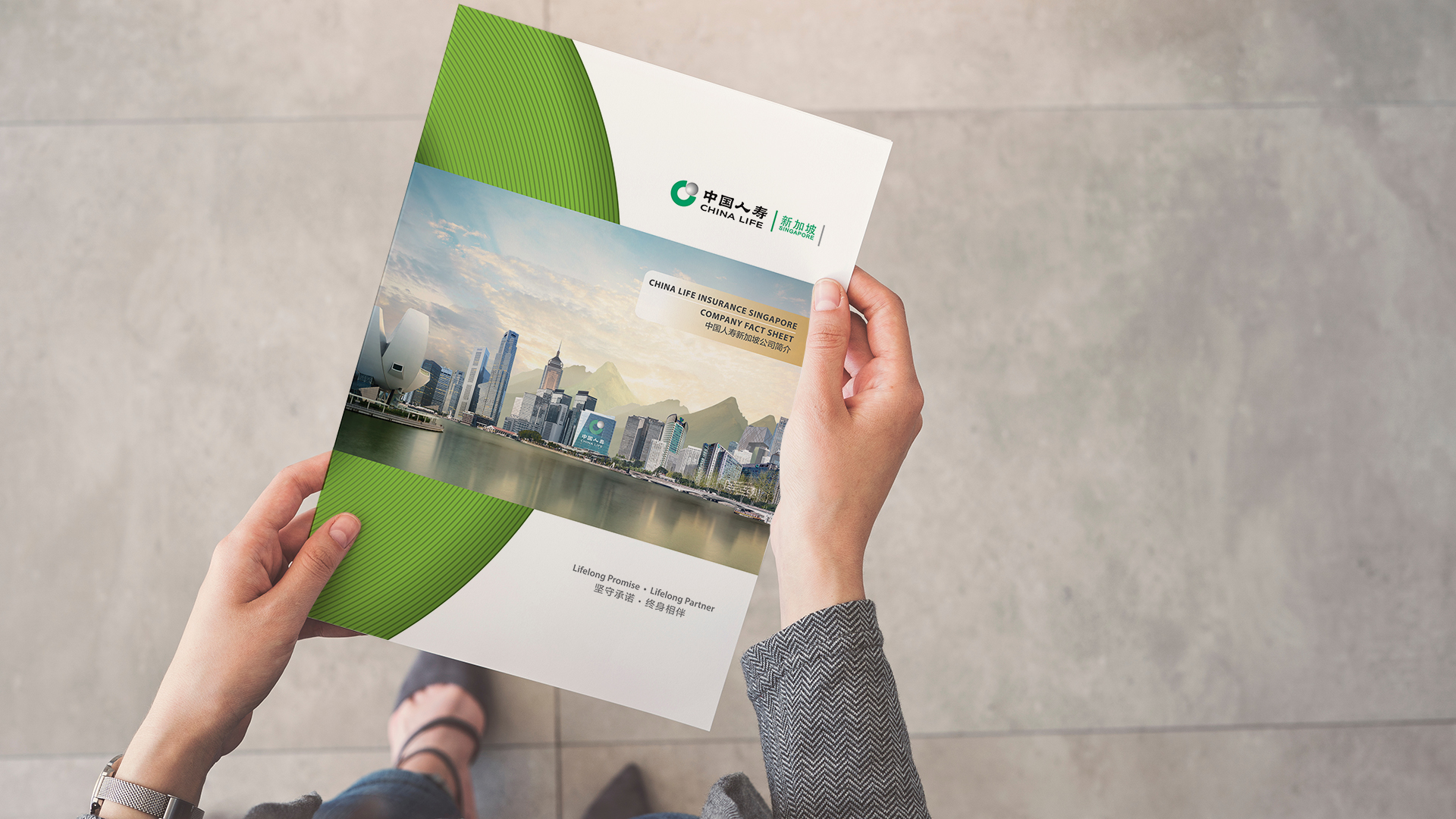
China Life Insurance — Institutional Entry into Singapore
China Life Insurance (Singapore), backed by China Life — a Fortune Global 500 company — required a corporate brochure to establish presence and credibility in Singapore.
The objectives were to:
Introduce China Life to a new regional audience
Signal institutional strength and global backing
Balance modern financial professionalism with cultural heritage
Communicate complex offerings with clarity
Deliver bilingual accessibility (English & Chinese)
The challenge was to position a global insurer with cultural depth — while earning trust in a competitive financial landscape.
-
We approached the project as a Product & Proposition Communication System — structuring clarity, authority and cultural alignment.
1. Symbolic Visual Narrative
The core visual integrated iconic financial skylines from:
Singapore
Hong Kong
China
These were composed into a unified landscape — symbolising cross-border strength and connectivity.
Behind the skyline, we introduced mountain forms as a Feng Shui symbol of stability and strong backing.
In front, flowing water represented continuity and prosperity — reflecting financial growth and sustained wealth flow.
The composition communicated:
Institutional grounding
Regional integration
Long-term prosperity
Without explicit explanation.
2. Cultural Modernisation
The design balanced:
Traditional Chinese symbolism
Contemporary financial visual language
Corporate colours were applied with restraint and confidence — reinforcing brand consistency while elevating perception.
The result was neither overly traditional nor purely corporate.
It was culturally intelligent.
3. Structured Proposition Clarity
The brochure translated complex insurance propositions into:
Clear bilingual messaging
Structured content hierarchy
Easy-to-digest infographics
Defined key selling points
Rather than overwhelming the reader with technical jargon, the system emphasised clarity and confidence.
The brochure functioned as both introduction and institutional statement.
-
China Life successfully established:
Strong institutional credibility in Singapore
Clear articulation of cross-border strength
Cultural resonance without compromising professionalism
Structured bilingual accessibility
The brochure did more than introduce a company.
It translated global authority into local trust.


Digital & Investor Systems
Three decades of experience.
A digital presence that needed to reflect it.
In financial advisory, perception shapes confidence long before the first consultation.
-
IPPFA — Modernising Digital Credibility for a Growth Advisory Firm
Established in 1983, IPPFA has served clients for over thirty years as a trusted financial advisory firm.
However, its corporate website no longer reflected:
The firm’s maturity and experience
Its evolving service capabilities
Its competitive positioning in a modern advisory landscape
The expectations of digitally informed investors
The challenge was not cosmetic redesign.
It was digital credibility alignment.
The website needed to communicate institutional confidence — not just information.
-
We approached the project as a Digital & Investor Architecture System — restructuring IPPFA’s online presence to reflect authority, clarity and forward momentum.
1. Visual Confidence Upgrade
The redesign introduced:
Strong, bold colour applications
Refined, modern typography
Updated image treatment
Clear content hierarchy
Bold colour highlights were strategically applied to key phrases and value propositions — guiding visitor attention and improving scanability.
The objective was clarity under speed.
Investors should understand positioning within seconds.
2. Structured Brand Consistency
The redesign followed a comprehensive brand guide to ensure alignment across:
Digital
Print
Corporate communications
Every page reinforced the same identity system — strengthening long-term brand recognition.
Consistency builds trust.
3. Investor-Oriented User Experience
The site architecture prioritised:
Clear service explanation
Simplified navigation
Professional tone
Strong visual discipline
Rather than overwhelming visitors with excessive text, the system focused on structured clarity — reinforcing advisory maturity.
-
The transformation delivered:
Elevated perception of institutional credibility
Stronger alignment between digital presence and advisory capability
Improved information accessibility for prospective clients
Cohesive brand reinforcement across touchpoints
IPPFA’s website evolved from an informational platform
into a structured digital confidence signal.
In financial advisory, digital maturity is not aesthetic.
It is trust infrastructure.


BRANDS WE WORK WITH


THINKING AHEAD
-
FINANCE
-
THINKING AHEAD - FINANCE -