Branding Agency for Healthcare & Medical Companies in Singapore and Asia
Healthcare and medical companies operate in a trust-driven industry where credibility and clarity are essential. From healthcare providers and medical technology firms to pharmaceutical and wellness brands, strong branding helps organisations communicate expertise, professionalism and differentiation.
DWHQ is a Singapore-based branding consultancy that helps healthcare and medical companies across Singapore and Asia build clear, trusted brands. Through brand strategy, positioning and AI-ready digital presence, we help healthcare organisations strengthen credibility, communicate value and stand out in competitive healthcare markets.
Healthcare innovation is complex. Communicating it with clarity is harder.
We stabilise positioning and trust as regulation and stakeholder scrutiny intensify.
Where Healthcare Brands Struggle as They Grow
Common challenges include:
Clinical credibility that does not translate into patient clarity
Scientific complexity limiting public understanding
Regulatory language overwhelming brand messaging
Misalignment between corporate, medical and marketing teams
Investor materials lacking structured differentiation
Employer positioning unclear in competitive talent markets
Public trust vulnerable to inconsistent communication
As growth accelerates, healthcare organisations often experience structural strain in communication.
These are not marketing issues.
They are structural communication gaps.
As organisations expand across markets, introduce new therapies and operate under increasing regulatory scrutiny, clarity becomes progressively harder to sustain.
Without deliberate architecture, growth magnifies reputational risk.
How We Help Healthcare Clients
Strengthening Credibility Across Complex Healthcare Systems
Scientific Experience Architecture
Healthcare brands operate in environments where credibility must be demonstrated with precision. We design structured symposium and exhibition environments that translate clinical complexity into clear, compliant and high-trust communication spaces.
Healthcare B2B Communication Systems
Structuring healthcare service communication for businesses — translating complex benefits into clear value for SME decision makers.
Healthcare Media & Thought Leadership Communication
Transforming research insights and institutional capabilities into clear media-ready narratives that capture attention and strengthen public credibility.
Clinical Communication
Transforming clinical information into clear, accessible communication that helps patients and caregivers understand treatment journeys.
Healthcare Media & Thought Leadership Communication
Media attention is earned through clarity.
Complex healthcare insights must be communicated in seconds.
-
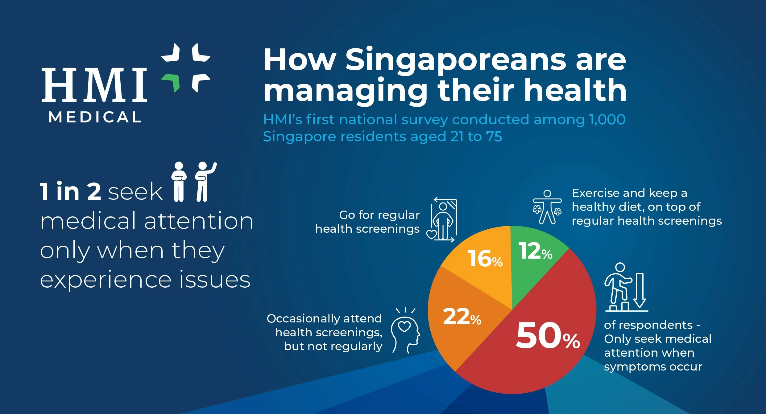
HMI Medical — National Health Survey Media Brief
HMI Medical conducted a national survey involving 1,000 Singapore residents aged 21 to 75, revealing insights into how Singaporeans manage their health.
The findings were important but complex, covering behaviours around health screening, healthcare navigation and patient decision-making.
HMI wanted to distribute the insights to major media outlets in Singapore through a press release.
However, traditional press releases often struggle to capture editorial attention.
The communication needed to:
Present key findings quickly
Highlight important statistics clearly
Position HMI as a credible healthcare voice
Help journalists immediately identify story angles
The challenge was to condense an extensive research narrative into a format that media could absorb within seconds.
-
DWHQ developed a Media Communication System designed to translate the research findings into a clear one-page visual narrative.
1. One-Page Media Insight Format
Rather than lengthy documentation, the insights were condensed into a single A4 visual briefing sheet.
This format allowed editors and journalists to:
Quickly understand the headline insights
Identify newsworthy statistics
Capture the broader healthcare narrative
The document functioned as a media-friendly summary of the full research report.
2. Headline-Driven Narrative
Strong, editorial-style headlines were introduced to surface the most important findings.
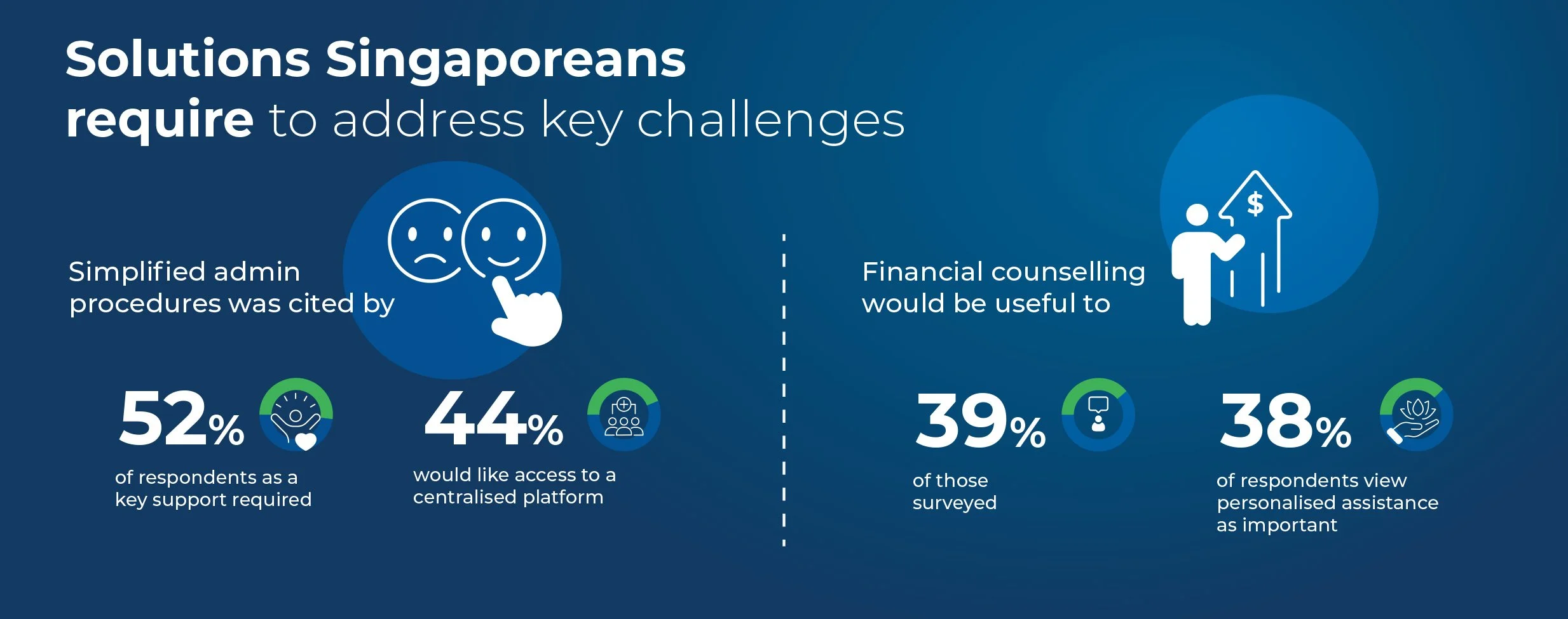
For example, the survey revealed that “1 in 2 seek medical attention only when they experience issues.”
This immediately highlighted a key healthcare behaviour trend among Singaporeans.
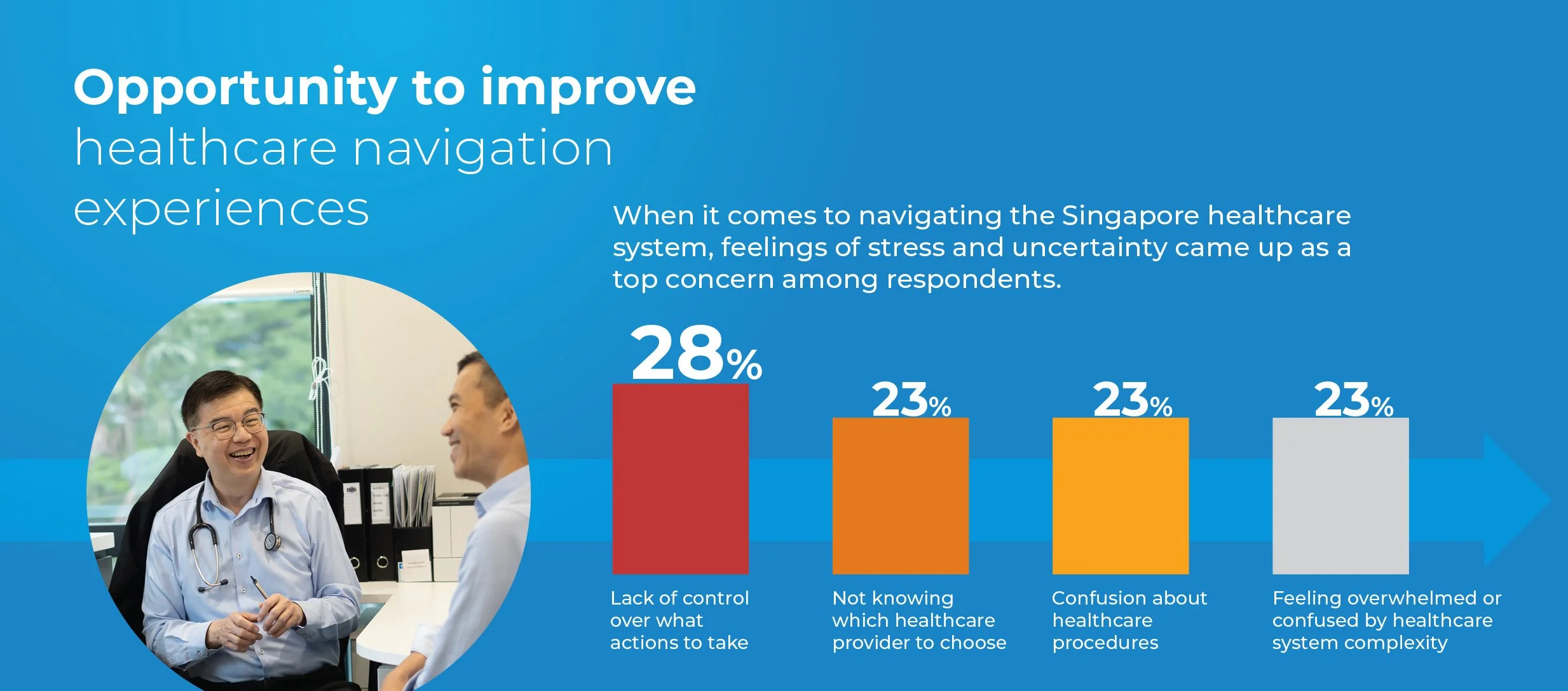
3. Data-Led Infographic Storytelling
Research statistics were translated into visual data formats including:
Pie charts explaining health-seeking behaviour
Data visualisations of patient decision barriers
Infographic highlights showing healthcare navigation challenges
For example, the survey identified major concerns among respondents including confusion about healthcare procedures and difficulty choosing providers.
This visual storytelling made the insights easy for media to interpret and reference.
4. Strategic Framing of Healthcare Challenges
The communication also positioned HMI within the broader national conversation around healthcare access and navigation.
The infographic highlighted opportunities for improvement in areas such as:
Simplified administrative procedures
Centralised healthcare platforms
Financial counselling support
This reframed the survey as part of a larger healthcare dialogue.
-
The communication achieved:
A highly digestible media briefing format
Clear surfacing of headline statistics
Stronger positioning of HMI as a healthcare thought leader
Increased likelihood of editorial pickup
The result was not simply a press release.
It was a structured media narrative designed to turn research insights into public conversation.
In media communication, clarity earns attention.
Scientific Experience Architecture
In healthcare, credibility must be experienced — not declared.
Scientific authority is built in the room.
-
Saizen China Exhibition & Regional Medical Symposium Systems
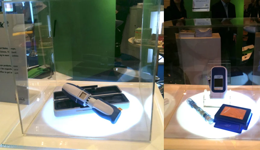
Saizen required a strong exhibition presence in Xi’an, China — within a highly competitive medical exhibition environment.
The objectives were to:
• Stand out within a dense exhibition hall
Encourage active visitor engagement
Demonstrate medical credibility
Reinforce brand visibility
Ensure structured flow across the booth
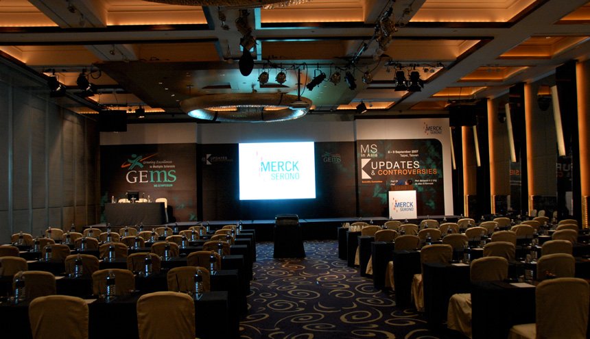
In parallel, DWHQ was engaged for regional symposium environments (including Merck Serono Asia Pacific events), requiring:
Stage backdrop systems
Abstract and programme materials
Invitations and lanyards
Premiums and delegate kits
Consistent scientific branding across touchpoints
The challenge was not aesthetics alone.
It was translating scientific authority into immersive, compliant, high-trust environments.
-
We approached the project as a Scientific Experience Architecture System — designing both spatial and communication ecosystems.
1. Open-Concept Spatial Strategy
Rather than enclosed booth design, we proposed:
An open roaming layout
Clear entry and exit pathways
Zoned interaction areas
Medical device display sections
Interactive engagement stations
The open architecture invited movement — increasing dwell time and accessibility.
2. Kinetic Brand Visibility
To cut through exhibition noise:
The logo was positioned centrally at elevation
A rotating clockwise motion was introduced
Lighting enhanced top-level visibility
Movement attracts attention.
Elevation signals authority.
The booth became a beacon within the hall.
3. Interactive Scientific Touchpoints
Engagement areas included:
Educational games
Medical device demonstrations
Product information zones
Each touchpoint reinforced clinical credibility while encouraging interaction.
This ensured engagement without diluting scientific seriousness.
4. Symposium Communication System
For regional medical symposiums, we structured a unified identity across:
Stage backdrops
Scientific abstracts
Programme books
Invitations
Lanyards
Delegate materials
Premiums
Every element followed a coherent visual and messaging framework.
Consistency builds trust in regulated environments.
5. Fabrication Oversight & Execution
DWHQ supervised fabrication and implementation on-site in China, ensuring:
Design integrity
Structural quality
Brand compliance
Execution precision
Scientific environments allow no compromise.
-
The campaign achieved:
Strong brand consistency across multiple occasions
Memorable visual recall
Increased engagement during festive periods
Reinforced emotional association with reliability and joy
Despite seasonal variation, the core brand identity remained intact and recognisable.
The deliveryman evolved — without compromising global brand discipline.


Healthcare B2B Communication Systems
Healthcare services only create value when businesses understand them.
Clarity drives adoption.
-
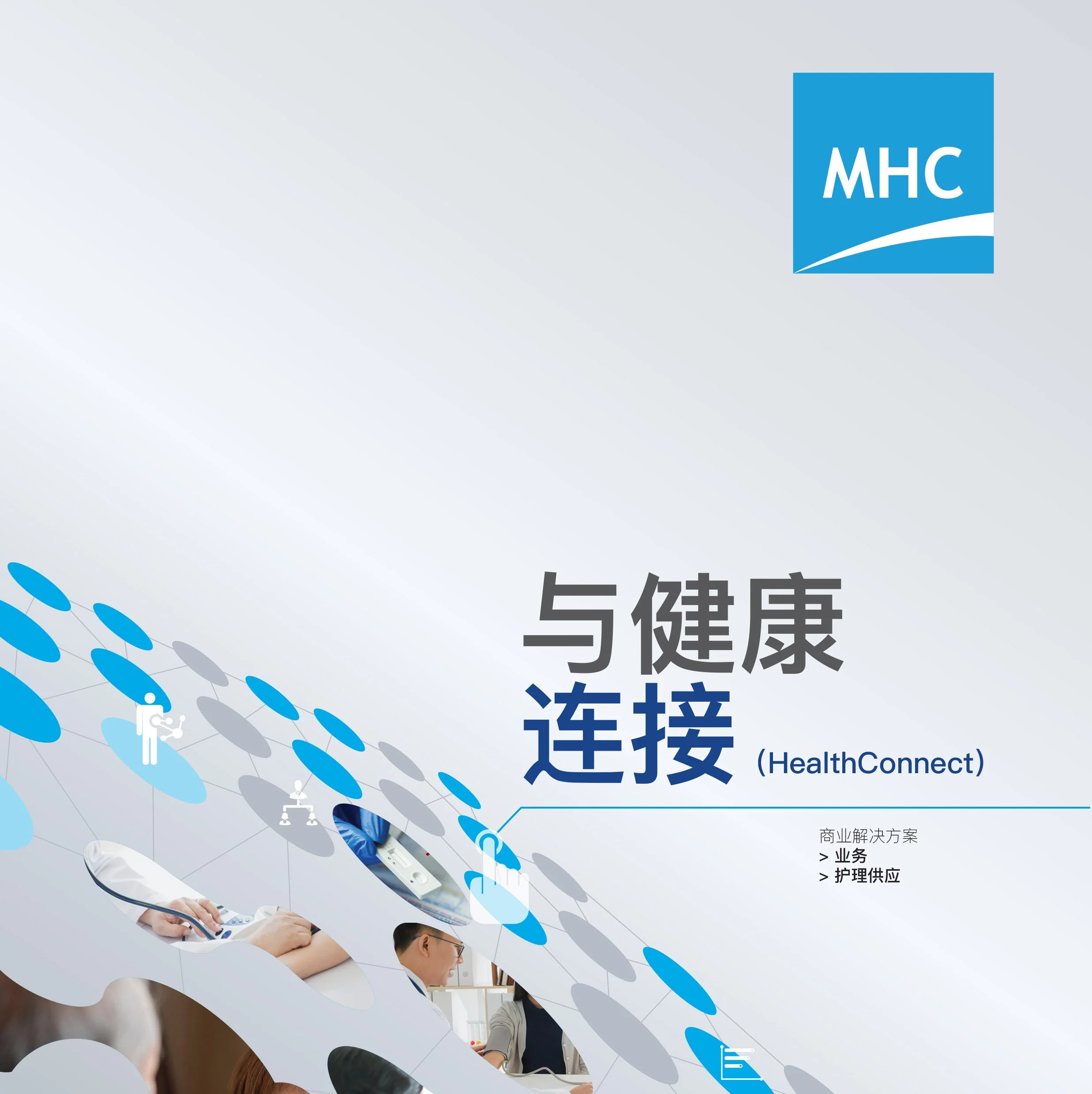
MHC Asia — SME Healthcare Communication System
MHC Asia approached DWHQ to strengthen how their healthcare services were communicated to SME clients.
While MHC offered a comprehensive suite of healthcare management solutions, the messaging often struggled to translate the full value of their services clearly to business owners.
The communication needed to:
Clearly explain healthcare service offerings
Highlight MHC’s operational strengths
Simplify complex service structures
Support SME client acquisition
Communicate effectively across both English and Chinese audiences
The challenge was to convert complex healthcare service structures into clear, accessible communication for busy business decision makers.
-
DWHQ developed a Healthcare B2B Communication System to structure MHC’s marketing and outreach materials.
1. Service Narrative Restructuring
We reorganised existing content to clearly present:
Core healthcare service offerings
Key operational advantages
SME value propositions
Structured service categories
This allowed prospective clients to quickly understand what MHC provides and how the services benefit their organisations.
2. Infographic-Led Communication
Complex service explanations were translated into:
Clear infographic systems
Visual breakdowns of healthcare benefits
Structured service comparison visuals
This allowed SME decision makers to grasp information quickly without navigating dense text.
3. Multi-Language Communication System
To better engage Chinese-speaking SME clients, we developed:
Chinese-language collateral versions
Tone and messaging adapted for cultural clarity
Consistent bilingual communication standards
This expanded MHC’s ability to reach a wider segment of the SME market.
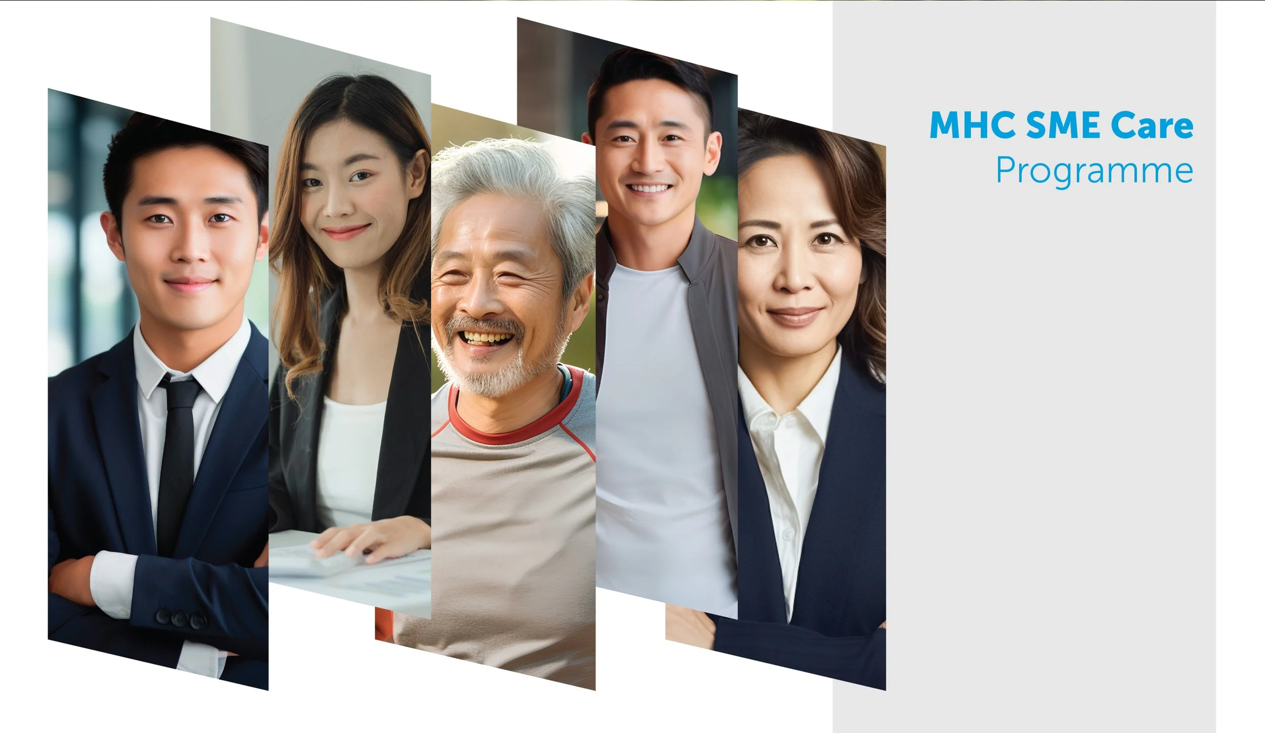
4. Care Kit Development for SME Clients
We created structured SME Care Kits that packaged essential information into clear, practical communication materials.
These kits helped business owners understand:
Healthcare programme benefits
Service access points
Operational processes
The kits functioned as both educational tools and sales enablement materials.
5. Collateral Brand System
A structured design framework was introduced across all materials, ensuring:
Visual consistency
Clear information hierarchy
Professional credibility
Scalable future communication assets
This system allowed MHC to maintain clarity across multiple marketing touchpoints.
-
The system achieved:
Clearer communication of healthcare services to SMEs
Stronger engagement with business decision makers
Expanded outreach through bilingual communication
Consistent and professional marketing collateral
The result was a structured communication system that helped MHC translate healthcare complexity into clear business value.
In B2B healthcare, clarity builds confidence.

Clinical Communication
Medical communication must be understood by the patient.
Sometimes, the patient is a child.
-
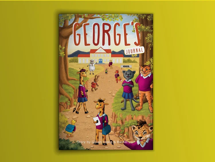
MERCK — Saizen® Children’s Patient Education Storybook
MERCK required a communication material to help explain Saizen® treatment to young patients and their parents.
The subject matter involved complex medical information about growth treatment — often overwhelming for children and difficult for parents to explain.
The communication needed to:
Simplify medical concepts for children
Support mothers in explaining treatment to their child
Reduce anxiety around medical treatment
Maintain scientific accuracy
Encourage engagement rather than fear
Traditional pharmaceutical brochures were too technical for this audience.
The challenge was to transform medical information into an approachable, child-friendly format.
-
DWHQ developed a Patient Education Communication System designed as a story-driven experience.
1. Storybook-Based Communication
Instead of a conventional brochure, the material was structured as a storybook that mothers could read together with their children.
The narrative approach helped children:
Understand the treatment journey
Relate to the information emotionally
Feel more comfortable with the medical process
Medical communication became a shared learning moment between parent and child.
2. Friendly Illustrative System
We created a visual language built around:
Friendly illustrations
Character-based storytelling
Warm colour palettes
Engaging pictorial explanations
These visuals translated medical ideas into concepts children could easily understand.
3. Child-Friendly Information Design
The layout was designed so children could:
Follow the story visually
Explore pages independently
Understand concepts through imagery and sequence
The structure balanced educational clarity with visual curiosity.
4. Simplifying Complex Medical Content
Technical treatment information was carefully translated into:
Simple narrative explanations
Visual storytelling elements
Easy-to-follow page flow
Scientific integrity remained intact while improving accessibility for young readers.
-
The patient education storybook achieved:
Greater understanding of treatment among young patients
Stronger parent-child engagement around medical information
Reduced anxiety around treatment journeys
A more human approach to pharmaceutical communication
The result was not simply a brochure.
It became a bridge between medical science and a child’s understanding.
In healthcare, empathy strengthens clarity.


BRANDS WE WORK WITH

THINKING AHEAD
-
HEALTHCARE
-
THINKING AHEAD - HEALTHCARE -